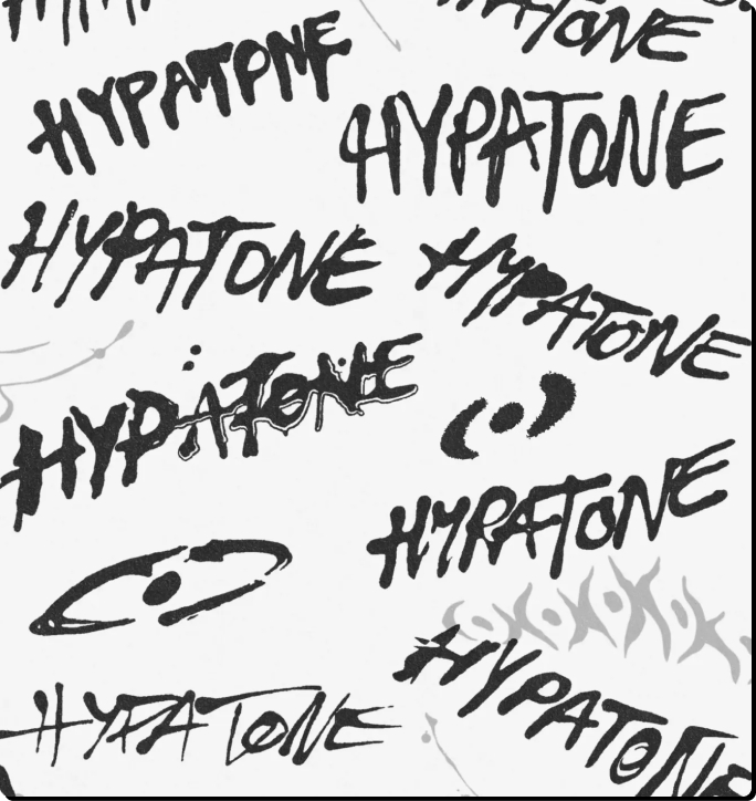
Hypatone brand identity — Brand Design

Hypatone Branding

Back to projects
A hands-on brand identity for Hypatone, combining painted typography, expressive graphics and vivid colour into a flexible system built for music, events and beyond.
// services
Branding
Building Brands With Pixels and Paint

Jared came to us because he connected with our approach to branding. He wanted something tactile, expressive and unmistakably human, with enough flexibility to work across motion, physical products and brand collateral.

With his work spanning music, events and commercial projects, the identity needed plenty of personality without being tied to one particular industry or aesthetic.

One requirement was particularly clear from the outset: "No A.I. slop."

Instead of chasing a polished, overly manufactured aesthetic, we set out to create something that celebrated the imperfections and unpredictability of making things by hand.
‍

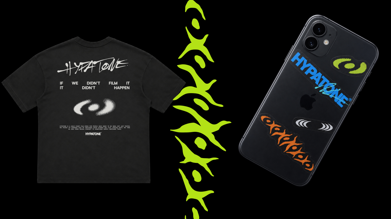
Hypatone brand identity — Merch and Stickers
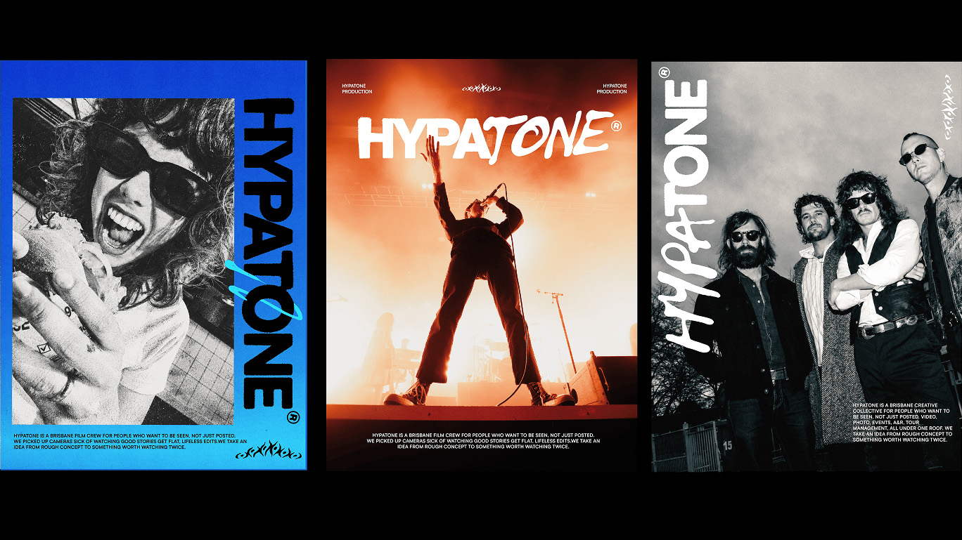
Hypatone brand identity — Layout Design
The Process
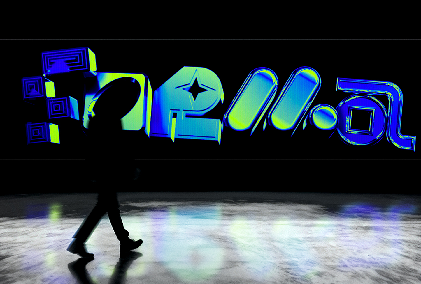
We put the computer aside and started with paint. Real brushstrokes became the foundation of Hypatone's fluid wordmark and a family of expressive graphic assets, each carrying the little imperfections that make something feel genuinely handmade. We scanned, refined and translated the artwork into a digital visual system that could stretch, shift and move across different applications without losing its character.
Start a Project