
Earth Brewing Branding Packaging
Bringing the
mountains to
your place.
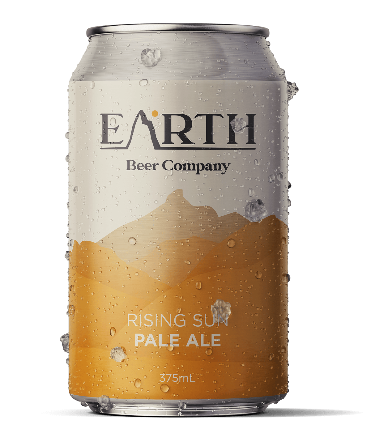
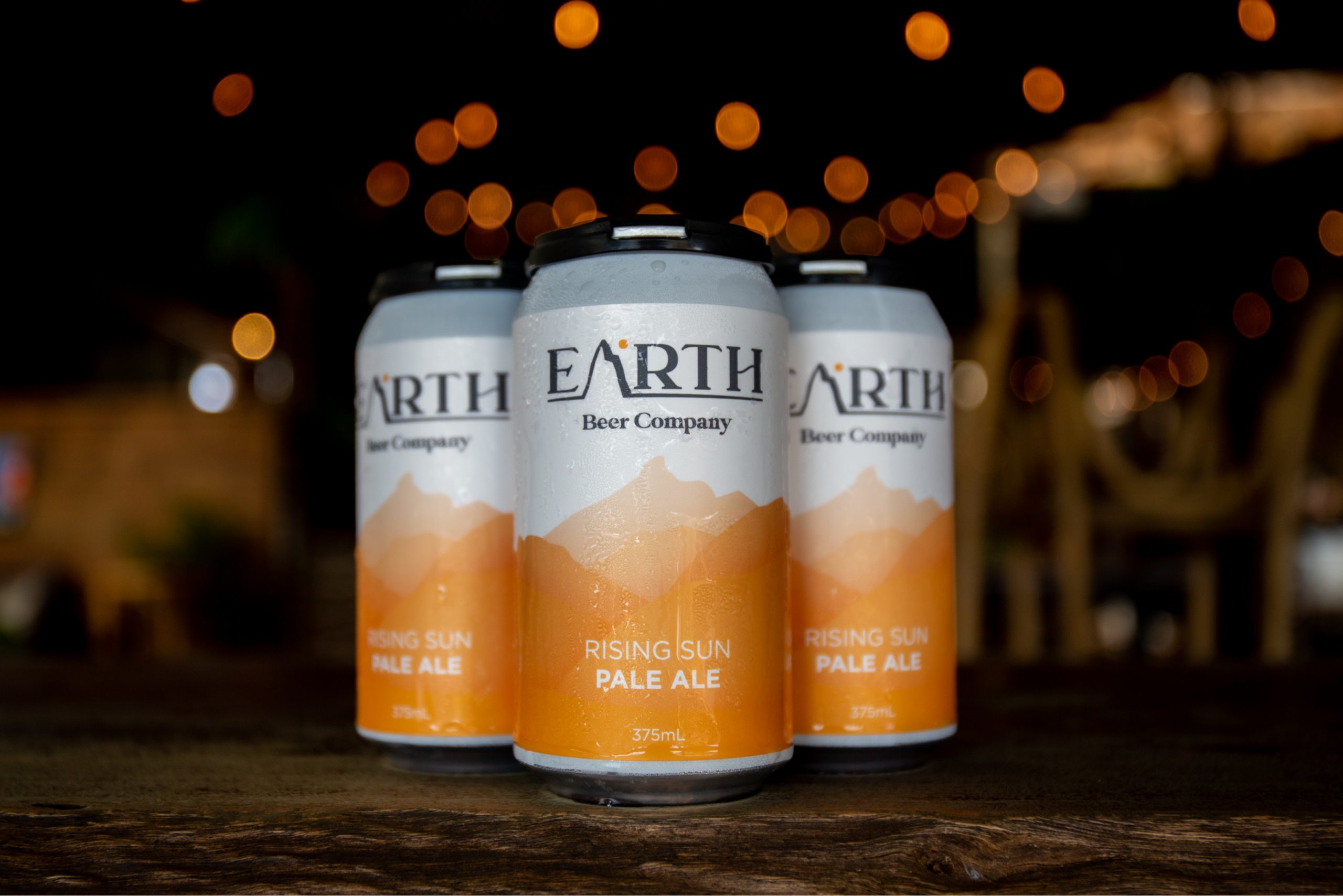
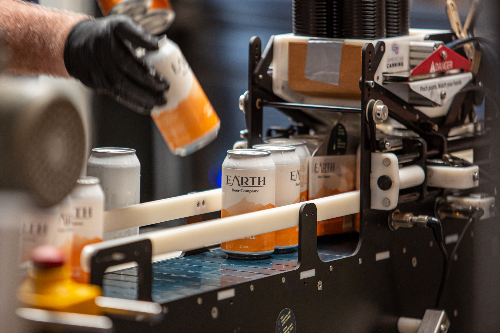
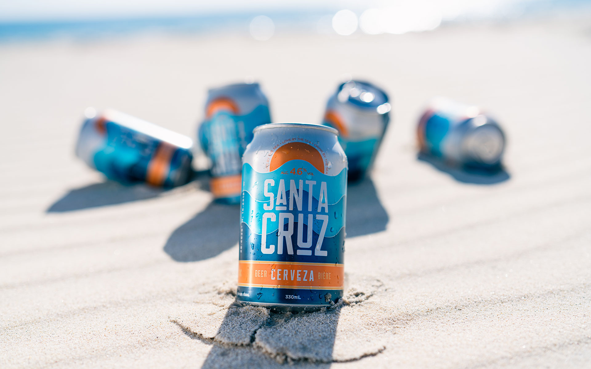
Earth Beer Company was going through a rebrand during 2020 and with COVID impacting the amount of trade they were allowed to do in the taproom, coupled with the demand locally for their craft beer, they decided to can their core range of brews to keep spirits high and lips wet.
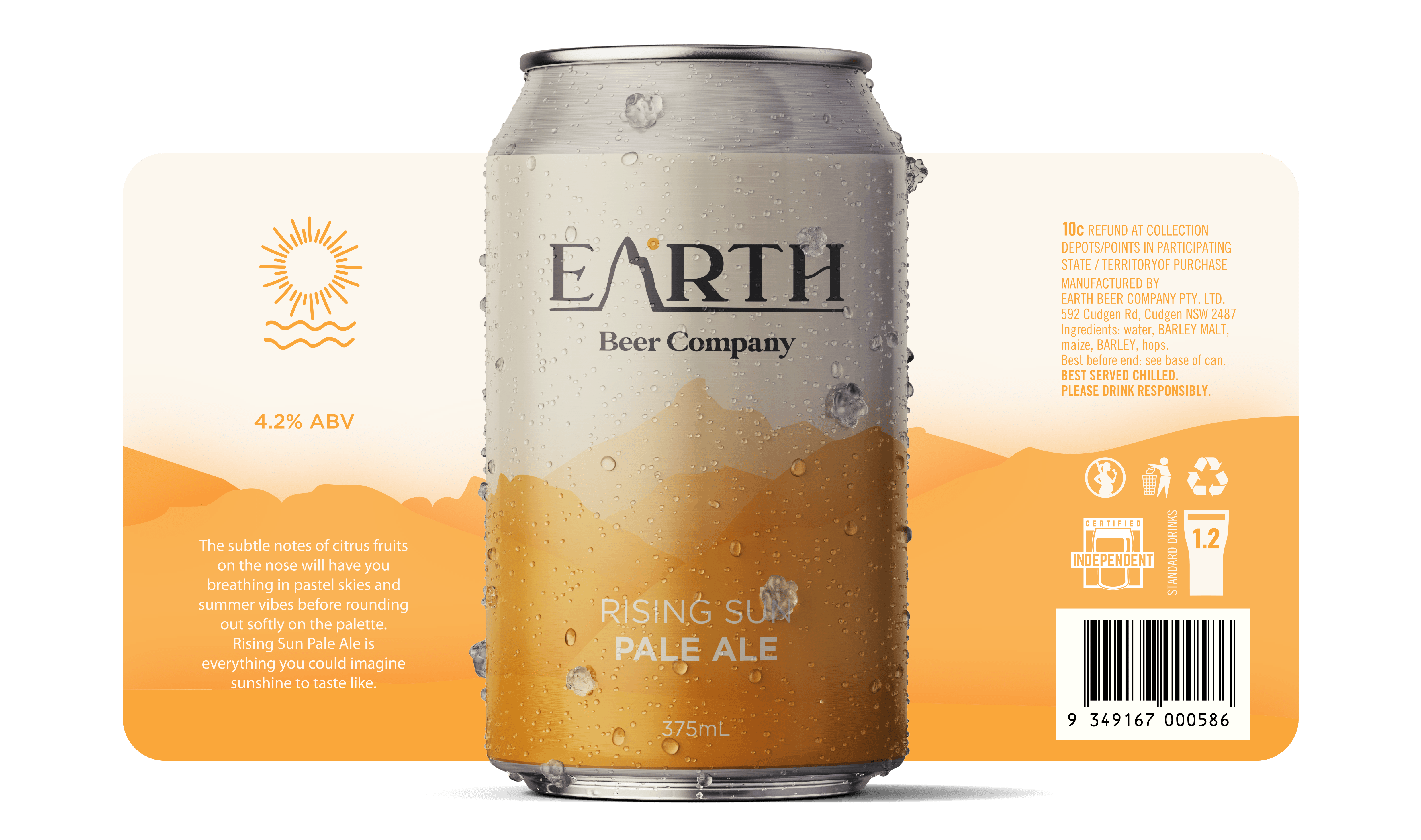
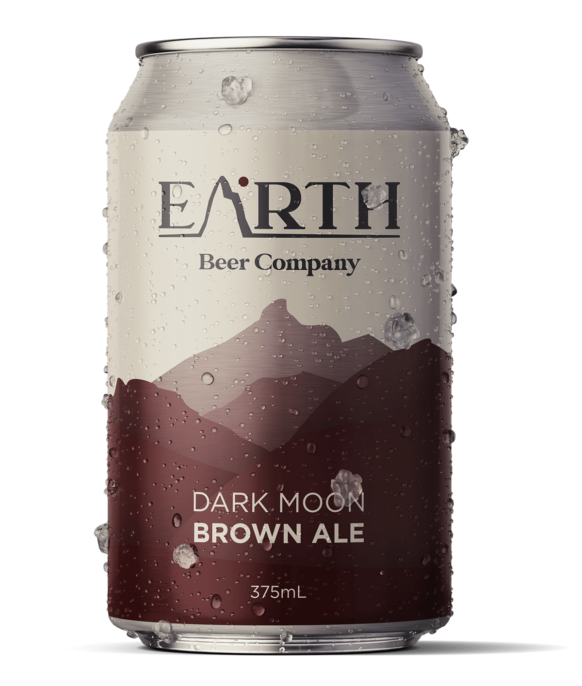
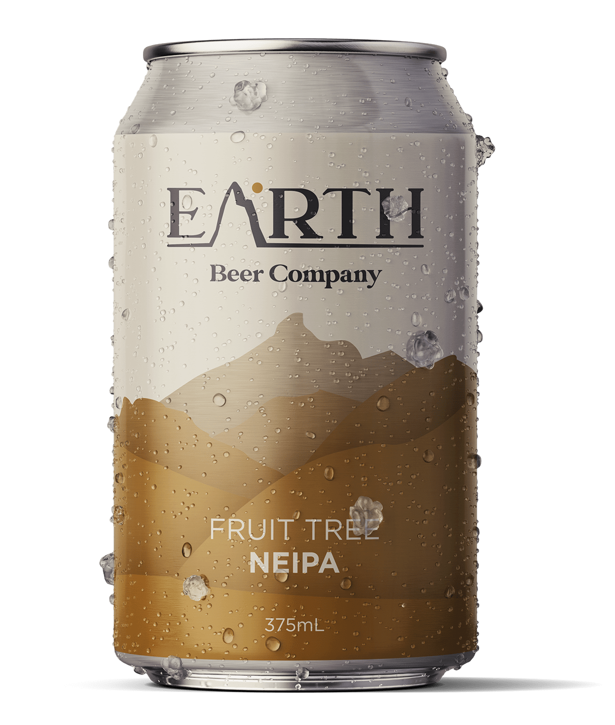
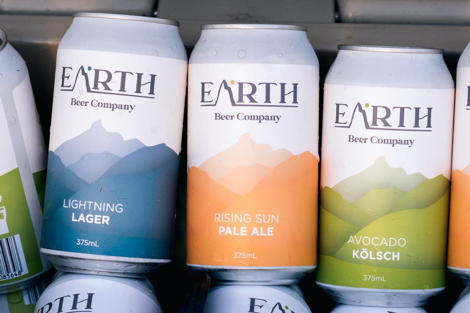
They wanted something that was going to be bold and stand off the shelves but the design still needed to represent the brewery - artistic, rural, beachy, and most of all earthy!
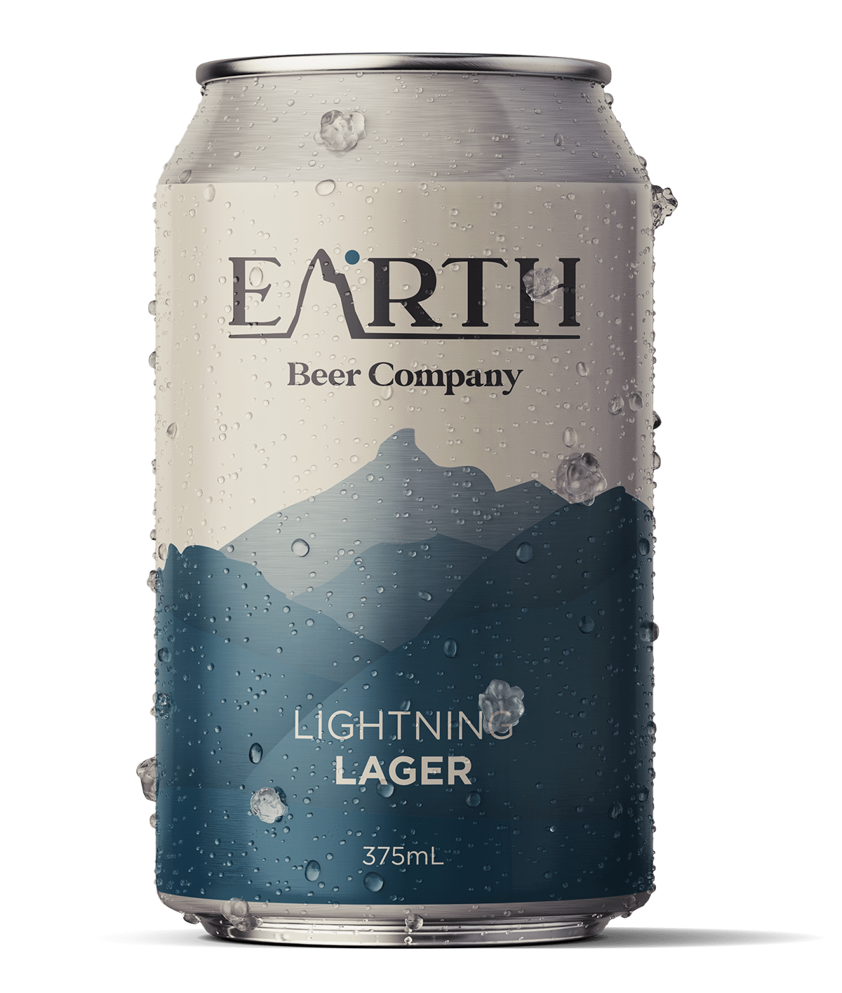
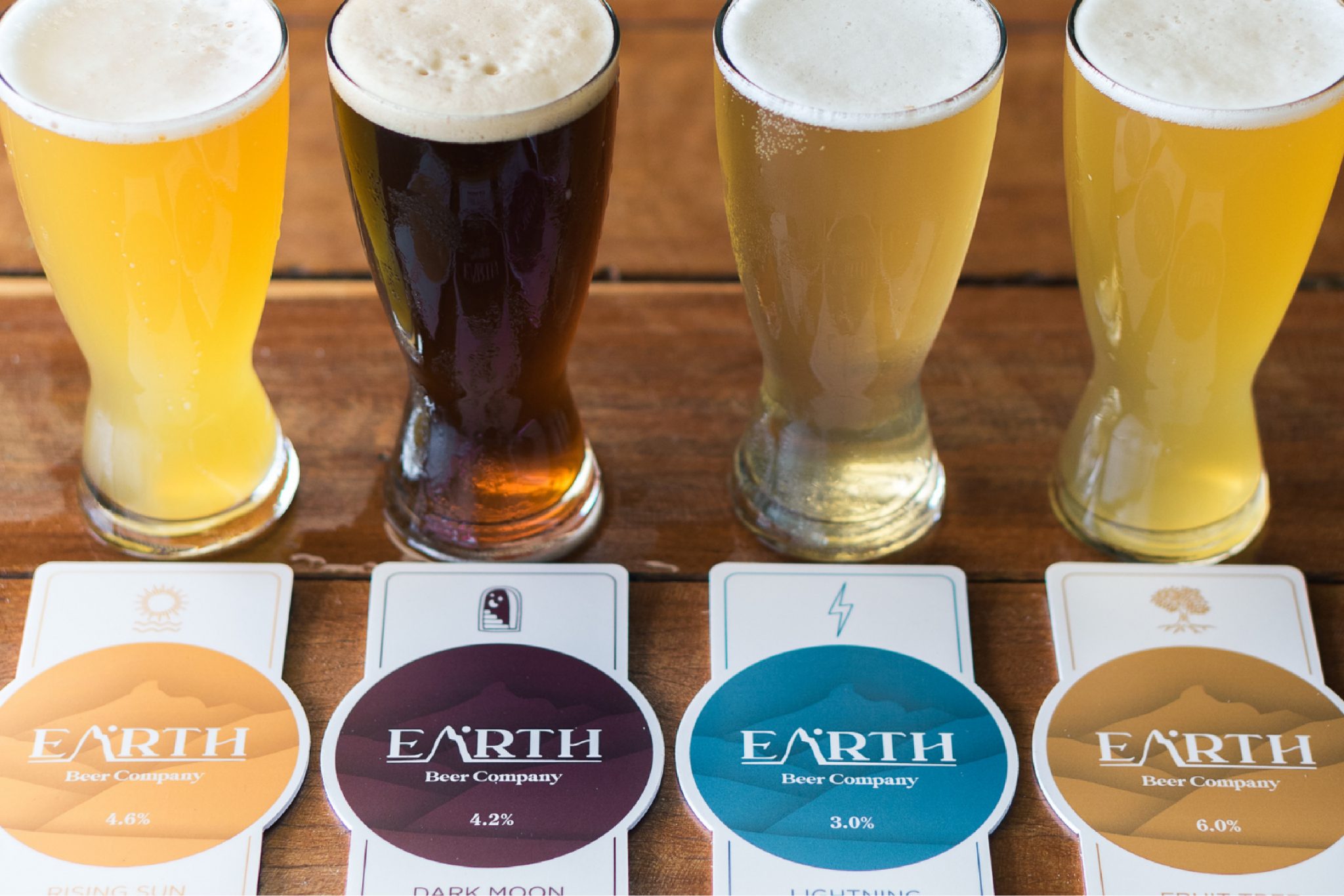
In short, we needed to bring the brand to life through the core range can design. We also needed to leave it open enough that we had options for additional varietals and limited release beers.

The
RESULT.
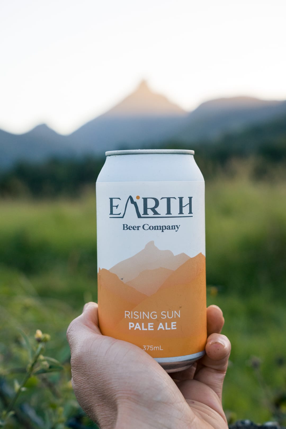
Having sampled many a beer (for research purposes of course) at their brewery, there were two things that really kept us and their other patrons coming back and that was the fact they are situated on an avocado farm and that you have a beautiful view of Mt Wollumbin (commonly known as Mt Warning) from the taproom.
Pouring over their brand assets and imagery, the scenery from the bar was continually striking and from our research, a key reason why the patrons loved the place.
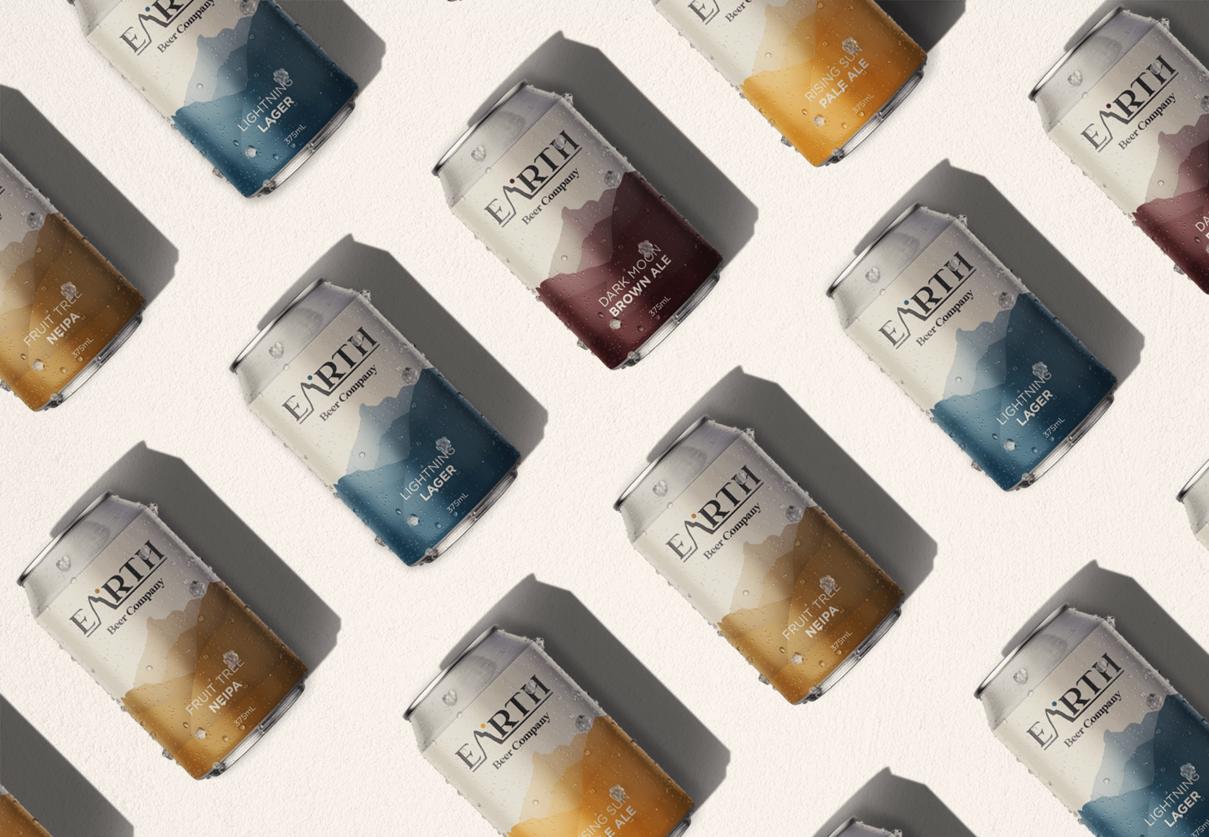
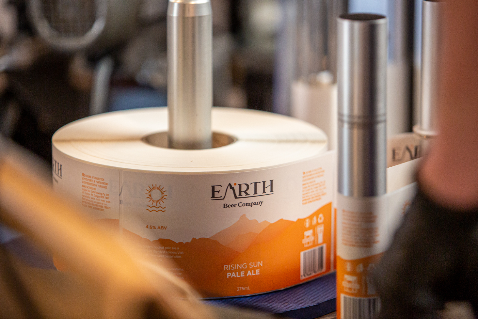
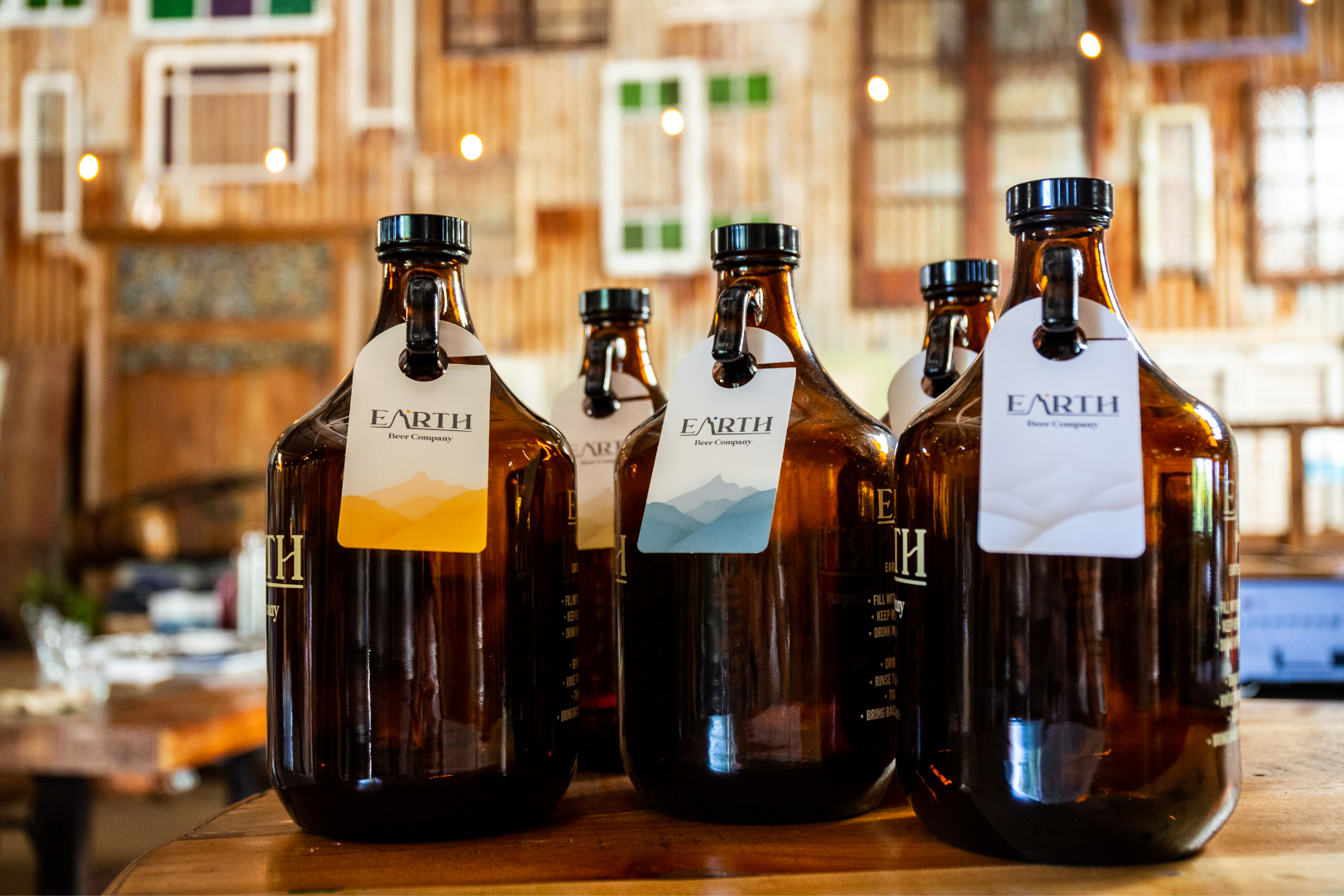
It made sense for us to lean into what people loved about the brewery already, so we used an image that was taken (courtesy of Jayanta Fowler) from Earth's bar looking out at the mountains as inspiration for the design. Using one colour (the colour of each of the beers) we created a vector version of the image and pulled back the opacity of each layer of the hills to give the design some depth and stay true to the natural layout of the mountain as possible.
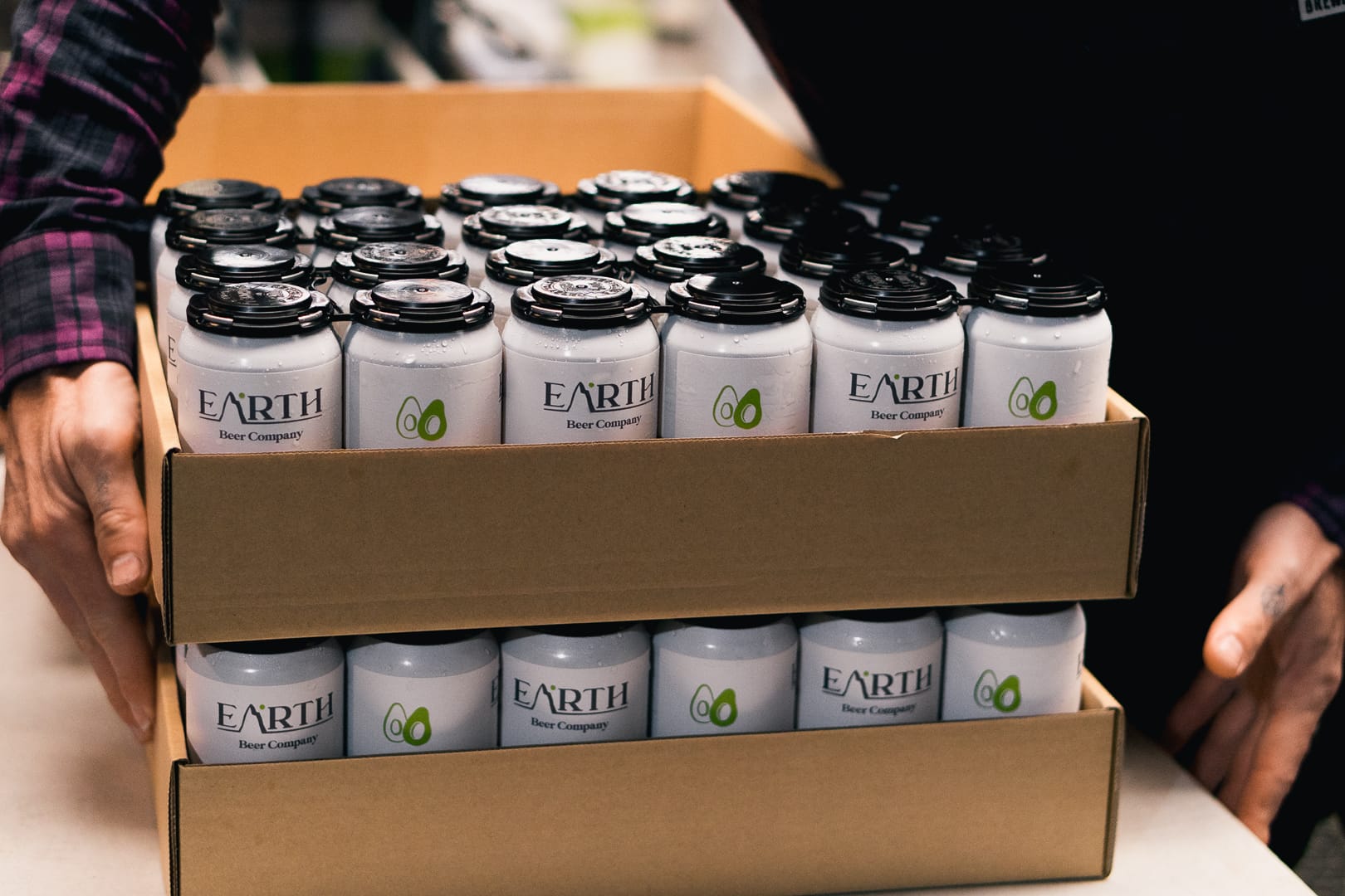
It resonated instantly with the brewery, its owners and its patrons and was instantly identifiable as Earth Beer Company. With the immediate success of the design, it's been rolled out as the key brand aesthetic across cartons, growlers, merch, their website and more.
IN USE.
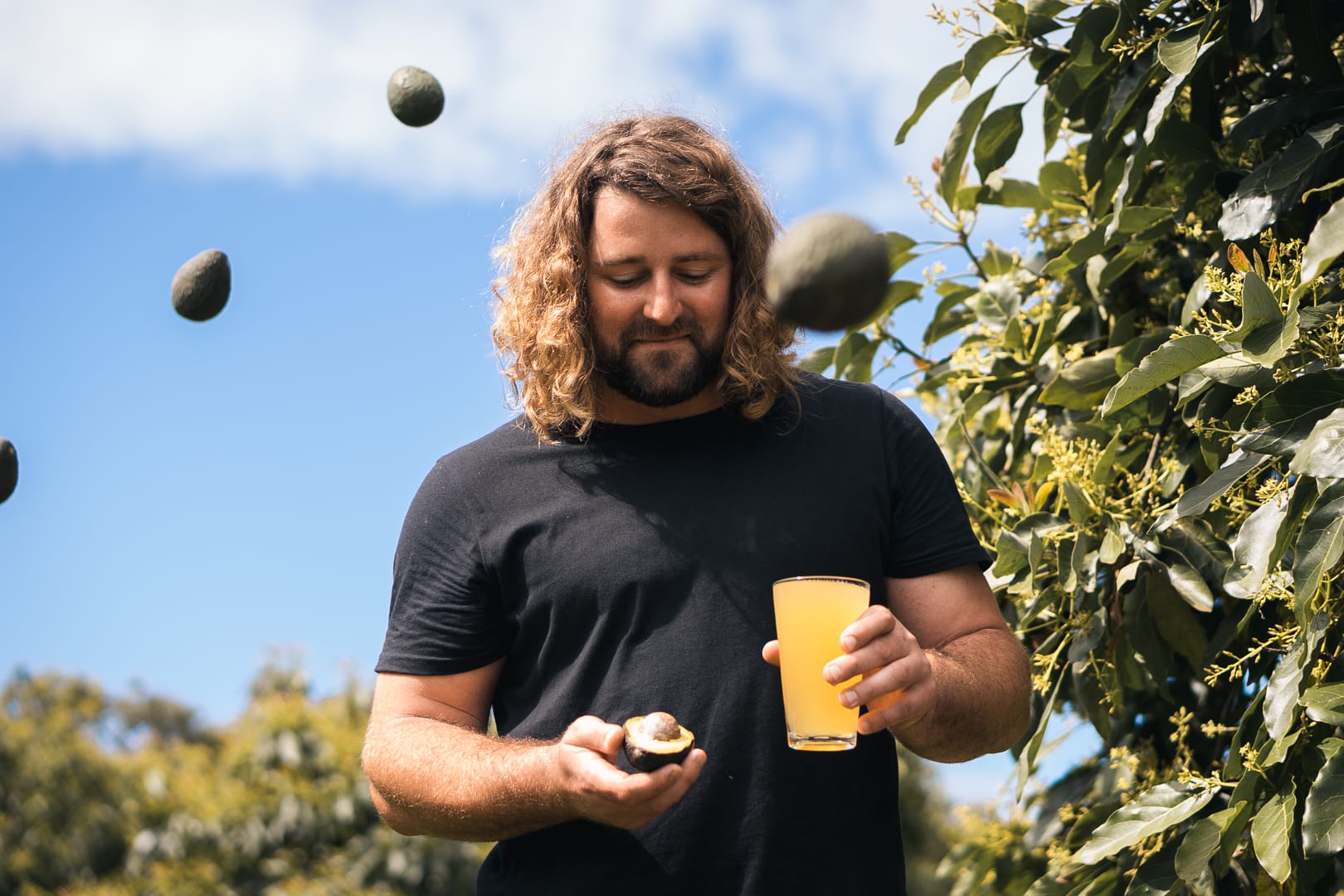
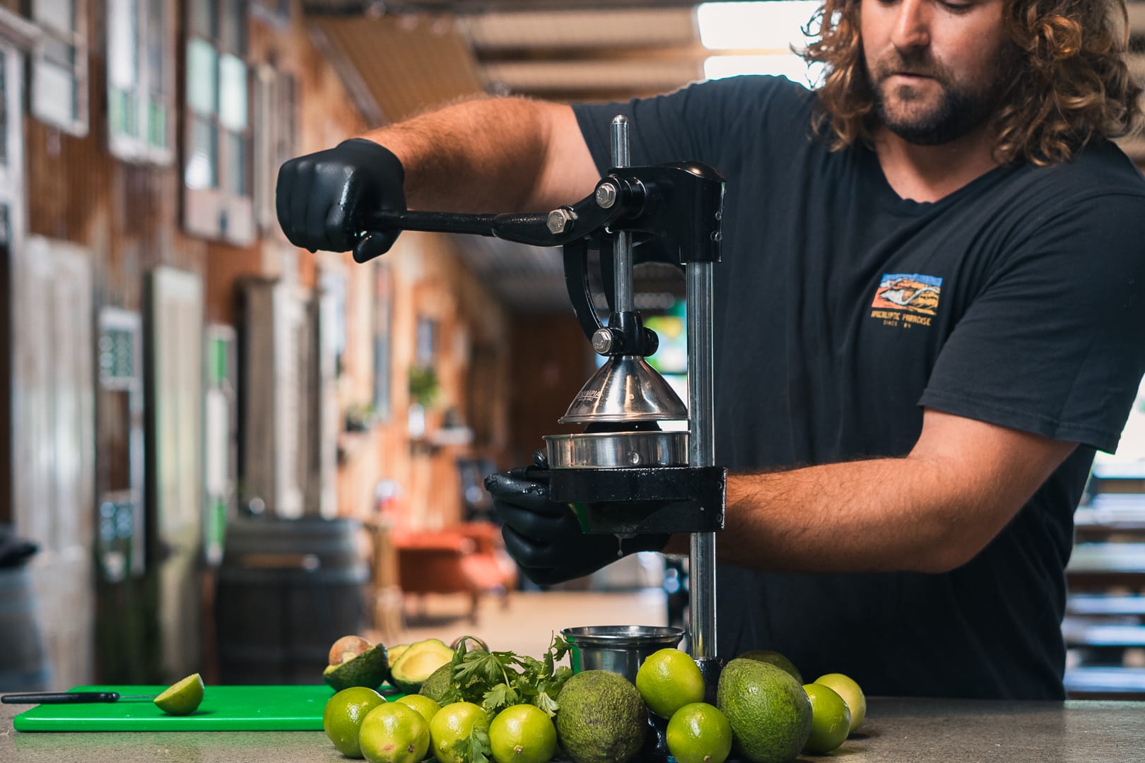
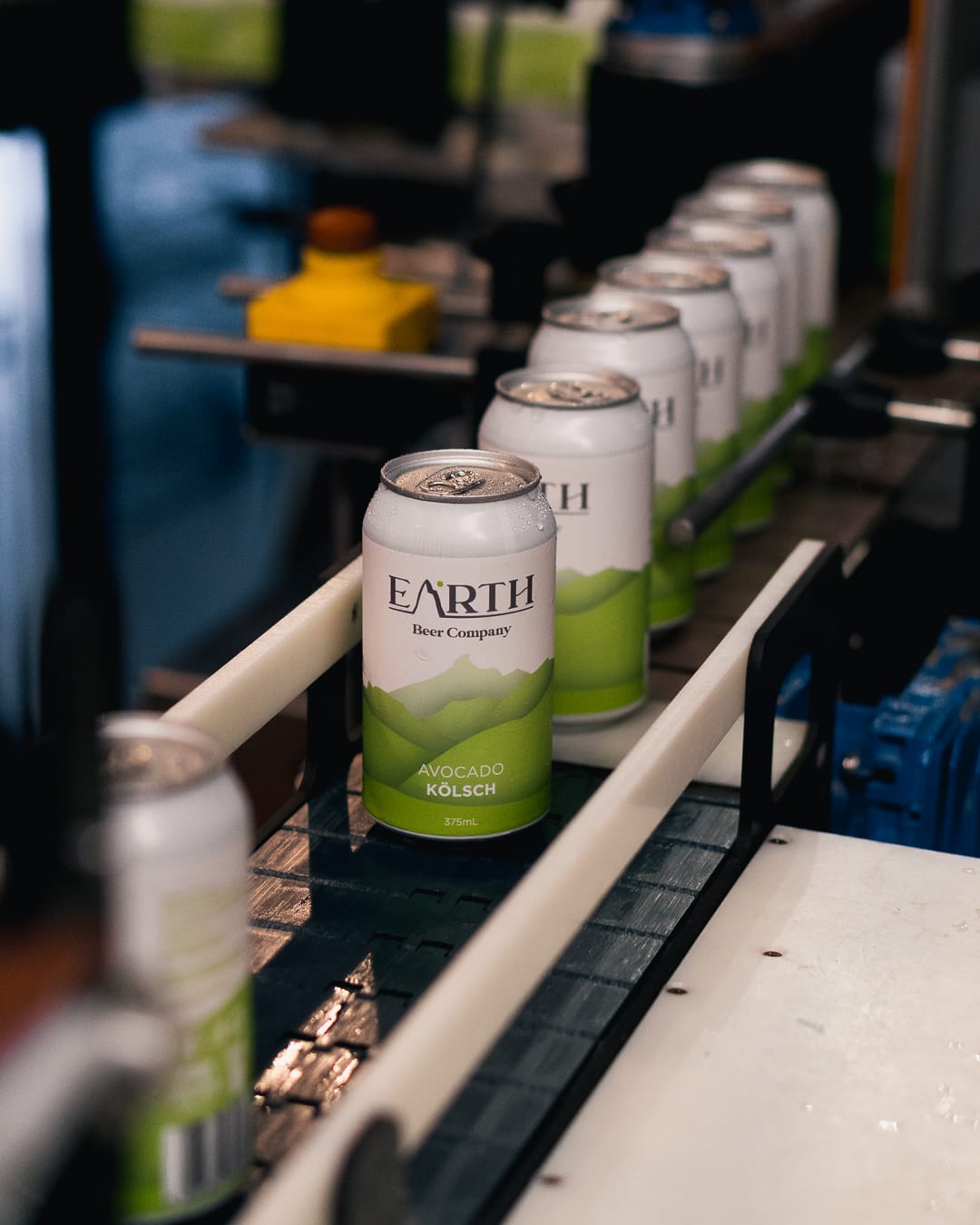
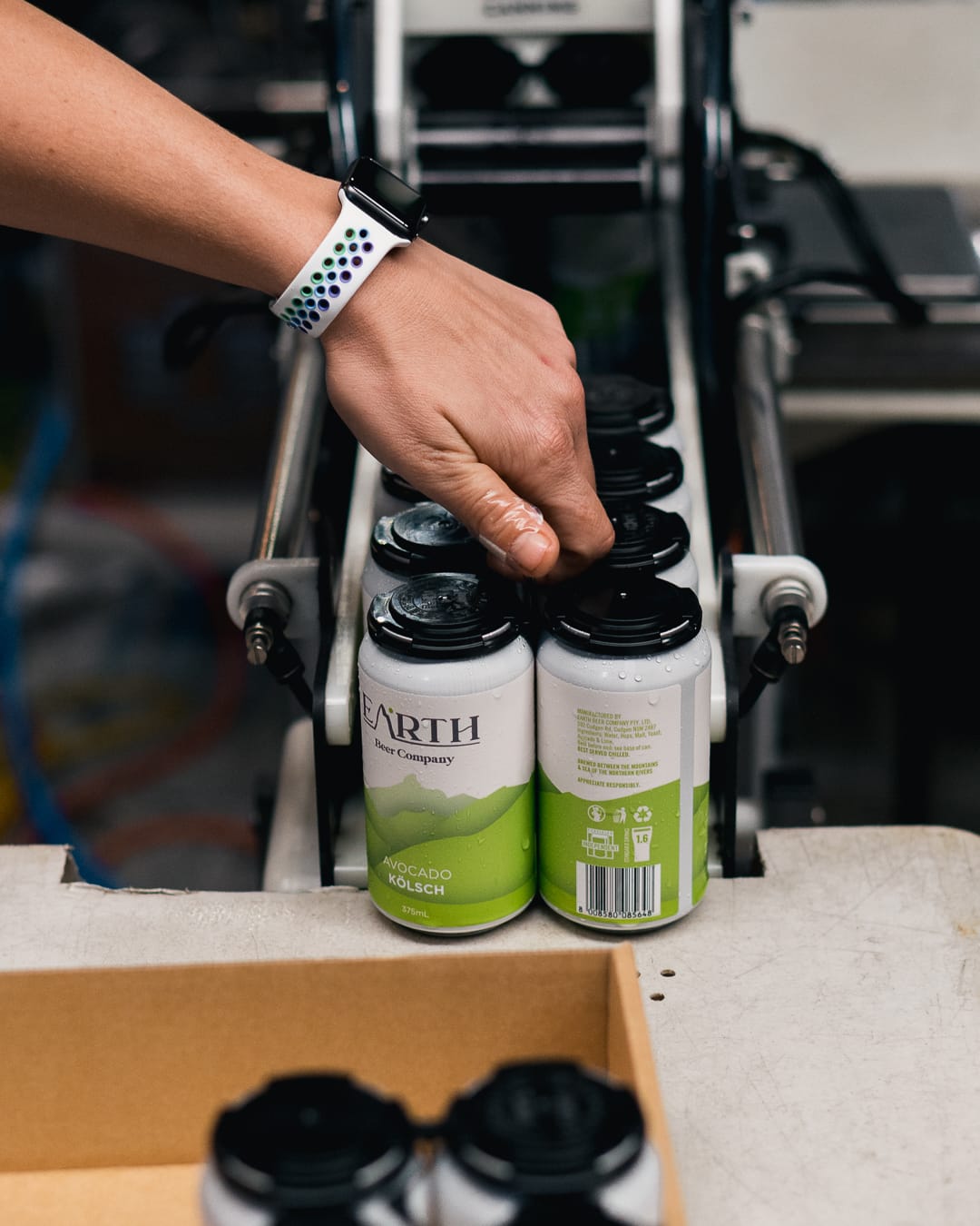
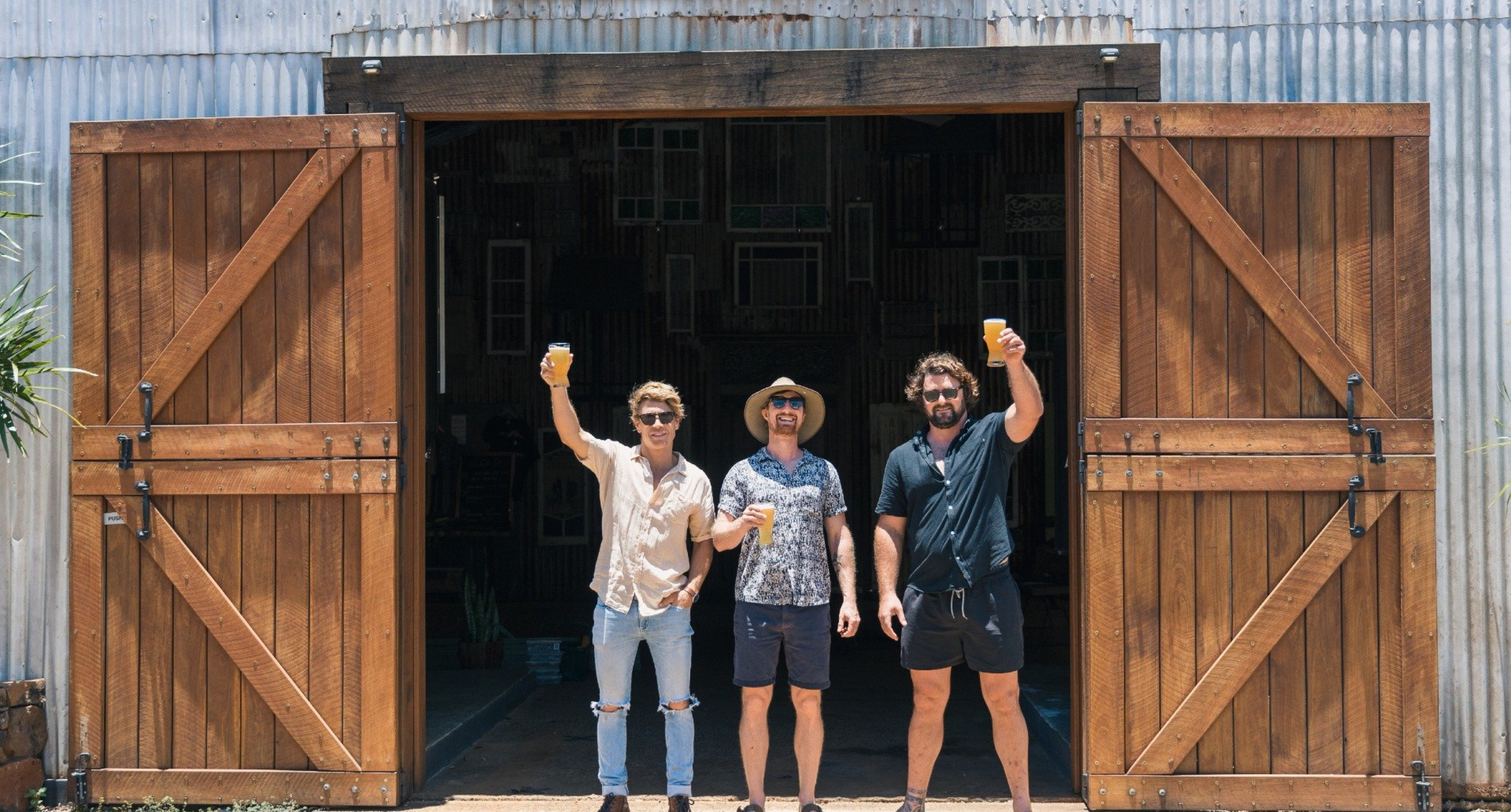
Carrying on the success from their initial canning run, the owners, Zeke, Richie and Tommy decided to put the neighbouring avocado farm to use and create a Avocado Kolsch. The perfect beer for spring and the perfect test for our design outside of the core range.
It was easily applicable and we were able to quickly adjust the design to suit and roll out across packaging, the website and EDM's.
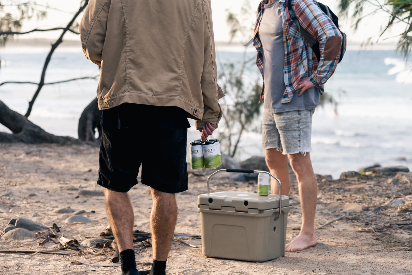
We're looking forward to continue to work with the Earth team as the brewery grows and as the beer list evolves and collaborating creatively with them to bring the unique Northern Rivers lifestyle in a can!


Our Services
BRANDING + STRATEGY
LOGO DESIGN
CAMPAIGN + ADVERTISING
WEBSITE DESIGN
ILLUSTRATION
APP DESIGN
MOTION + ANIMATION
MURALS
Case Studies



Let's WORK TOGETHER
HELLO@PENNYBRIDGE.COM.AU
Pennybridge Creative
© All right reserved
Pioneers of Brand pennybridge.com.au
Pennybridge Creative
© All right reserved
Pioneers of Brand | Pennybridge.com.au

