
PERFORMANCE AND PLANET
CAN CO-EXIST
PROJECT BLANK
Project Blank are a sustainable wetsuit and ocean goods company that are in pursuit of a happier planet. With early success in the business, it became evident that they weren't sure of the direction of the brand moving forward and engaged Pennybridge to develop their brand strategy and carry this through into their brand guidelines, creative direction and marketing collateral.
We worked with the team and through a brand strategy workshop, we highlighted their strength areas while finding areas of opportunity moving forward. With their entire range moving towards environmentally friendly products and manufacturing, it was important to ensure that this focus wouldn't compromise the performance of the products, more an added bonus for the customer and the planet.
WHAT WE DID
BRAND STRATEGY
CREATIVE DIRECTION
LOGO DESIGN
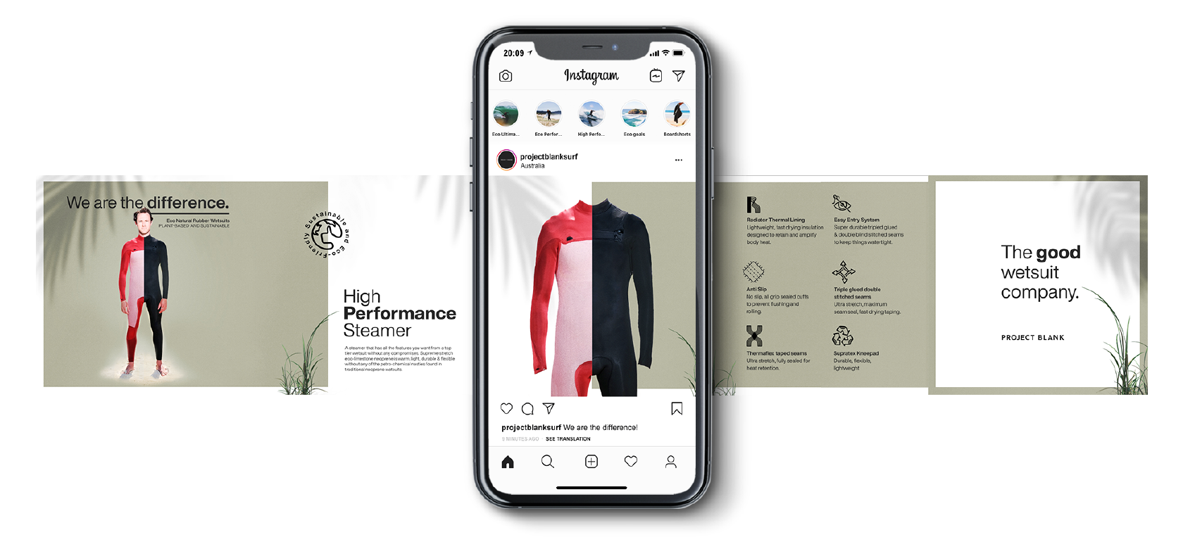
SOCIALS
Merch
PAckaging
CAMPAIGN ASSETS
Website Design
EDM DESIGN
PHOTOGRAPHY

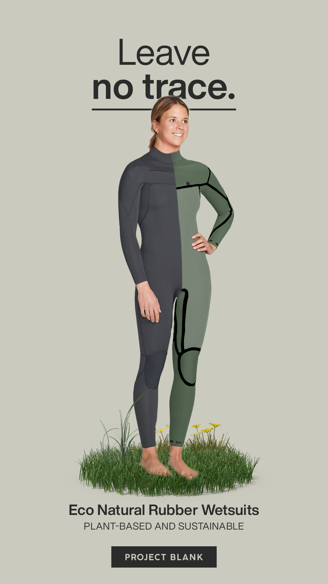
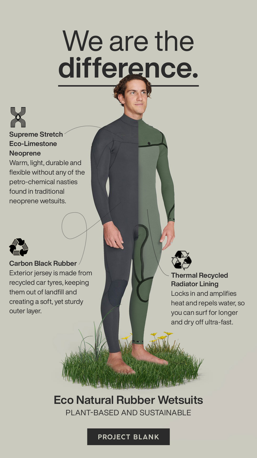
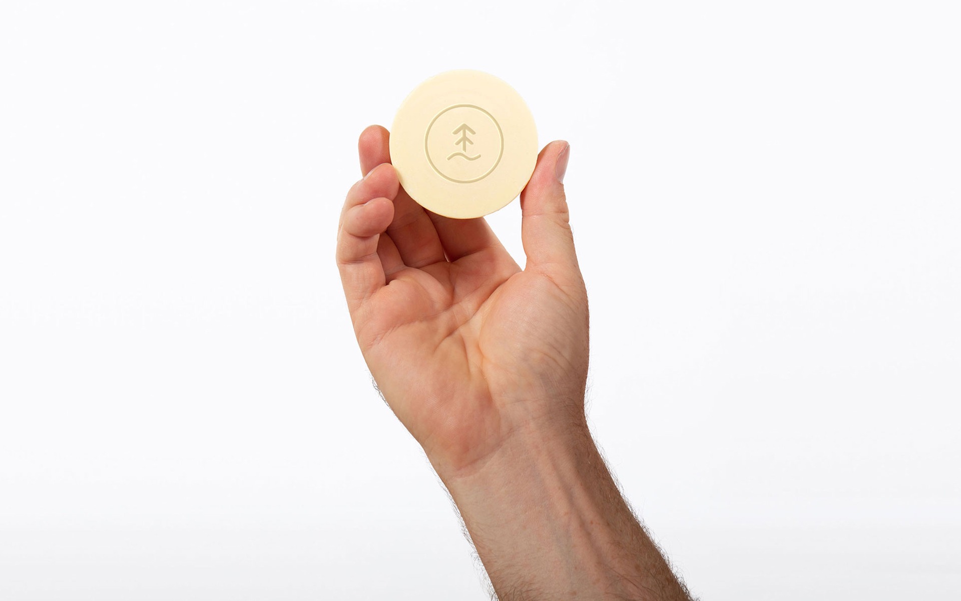
THE ECO
BADGE.
The only problem with having consciously blank branded products is that no one can tell that they are Project Blank products. Now, this wouldn't be an issue only that Project Blank customers buy their products, largely because they are better for the environment, and in order to create a movement or trend in the space, people need to see other people wearing sustainable products.
As such, we thought it would be best to develop an icon or unique identifier that let people know, that this product is an environmentally friendly product, made by Project Blank. We developed a PB monogram made out of leaves to say exactly that!


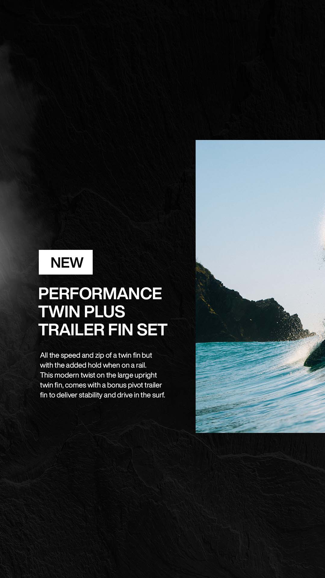
CAMPAIGN
ASSETS.
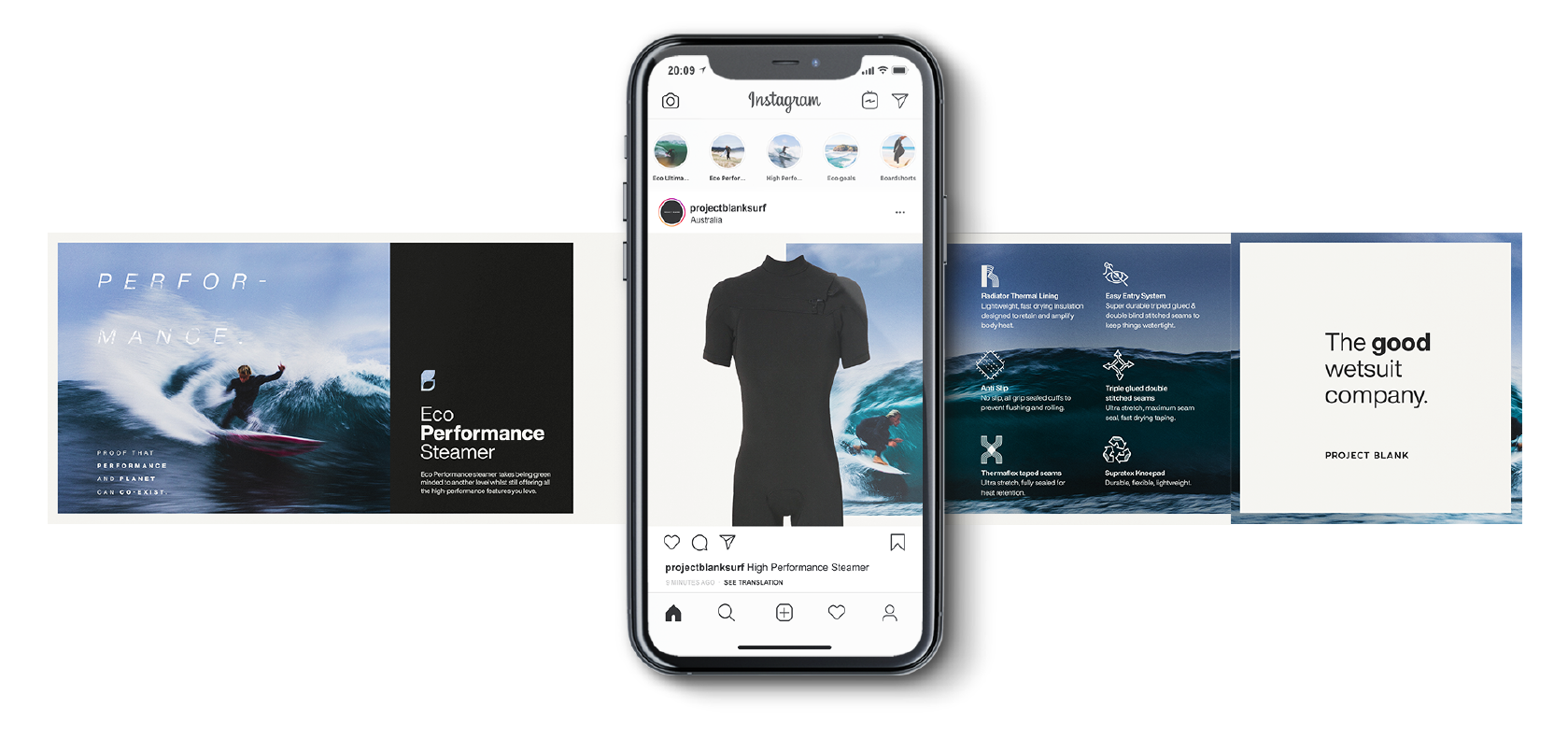
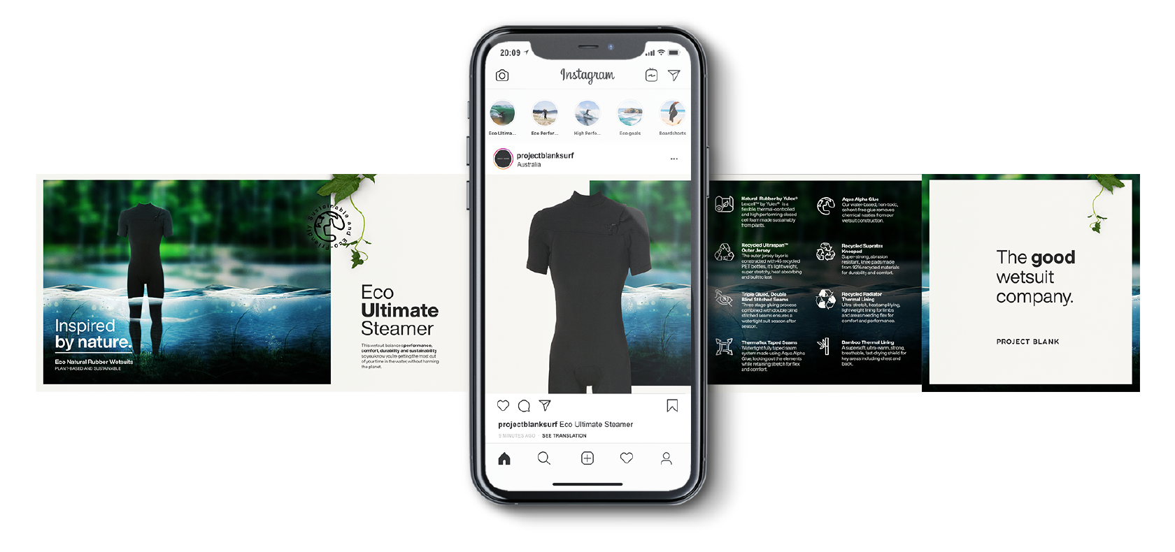
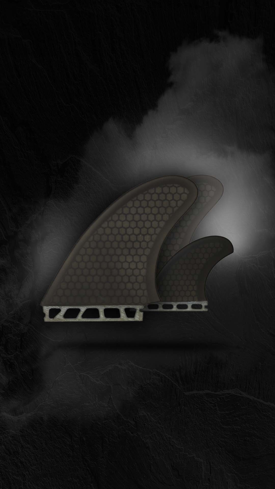
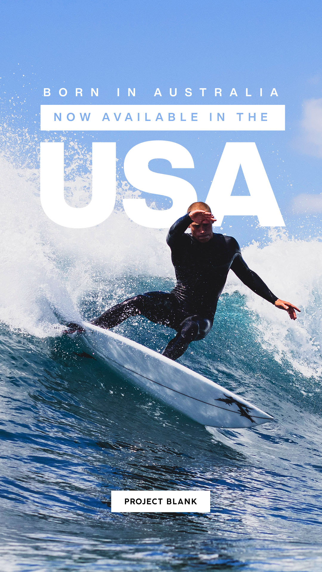
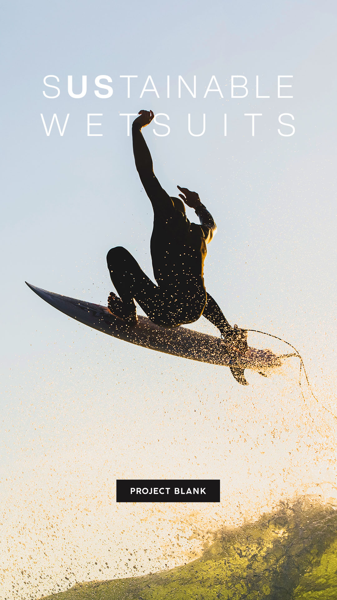
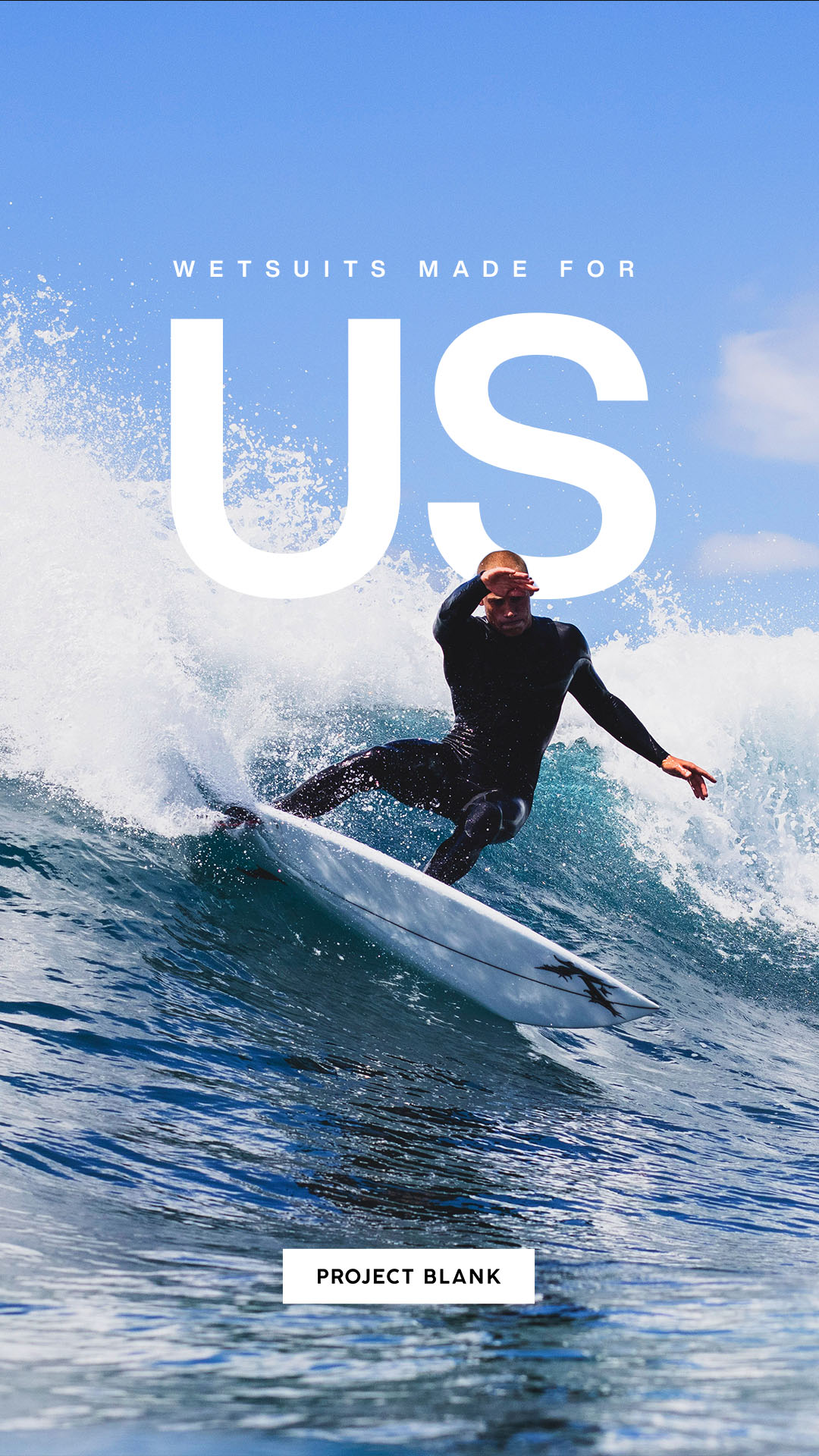
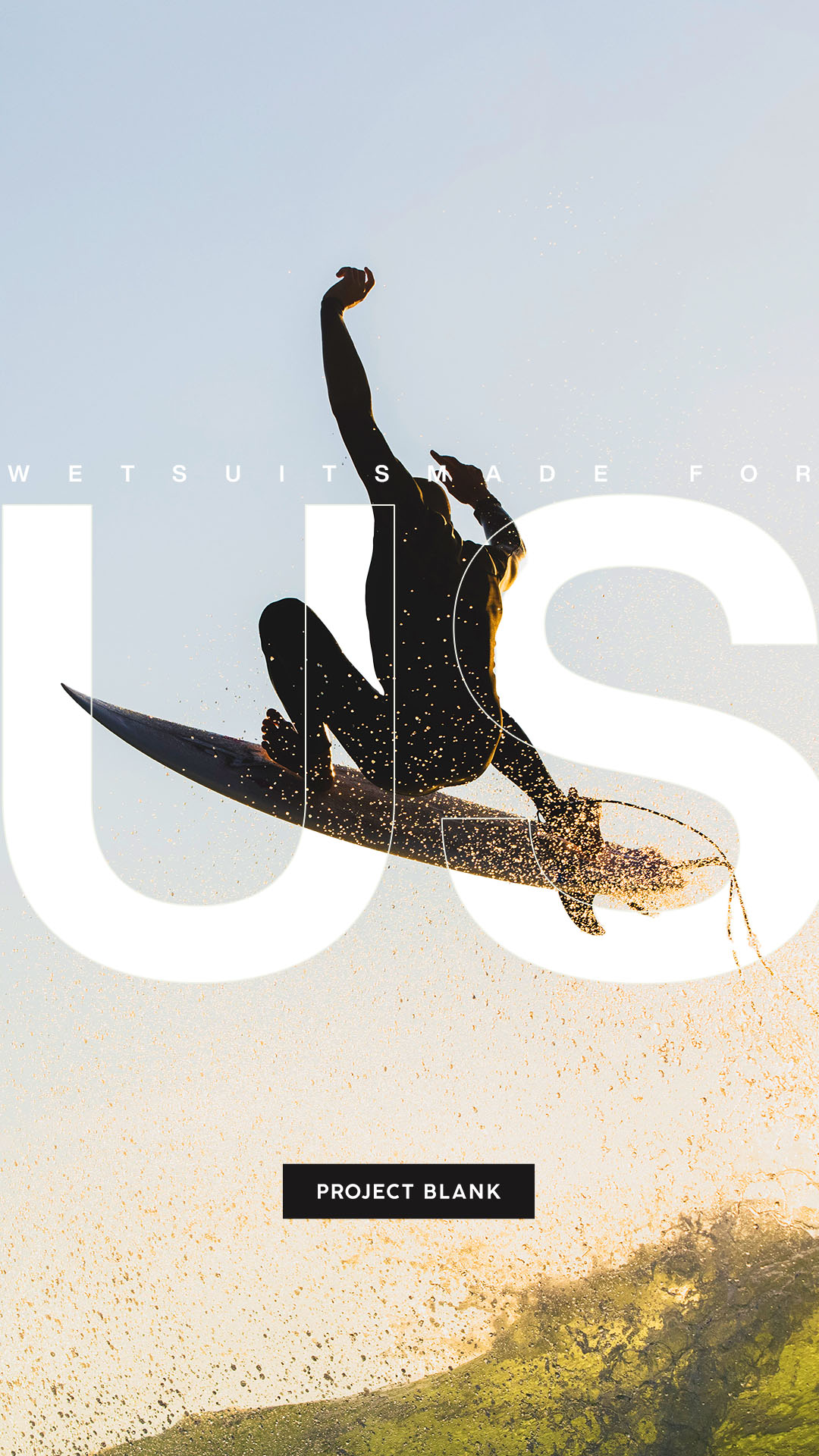
We were tasked with developing and creating compelling content that both resonated with the Project Blank and got their product message across. While they are a budget player in the market, for each campaign, we often had to create three varying sets of creative for the different parts of the funnel (top of funnel - planet focus, middle of funnel - performance focus, bottom of funnel - price focus).
We worked across photography, copywriting, design, print, and digital to ensure that all the touchpoints were met and all key visuals were strong and engaging.

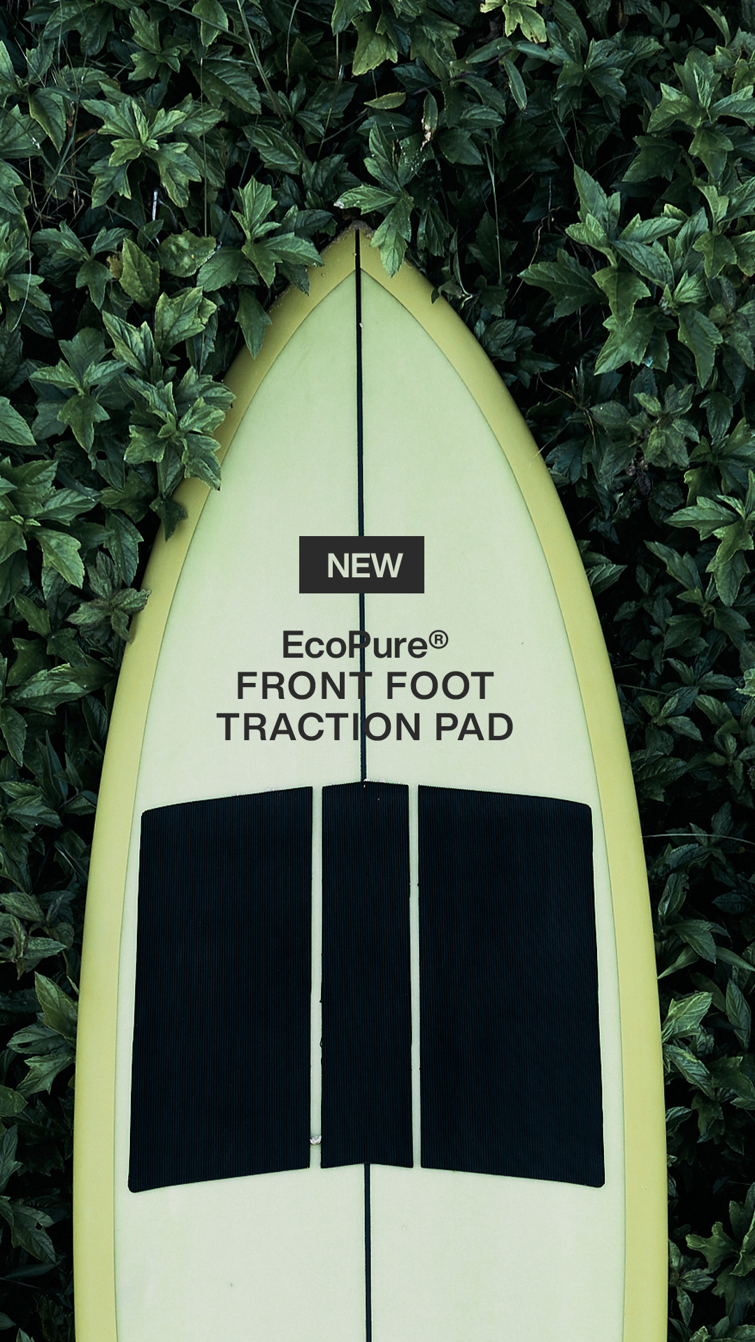
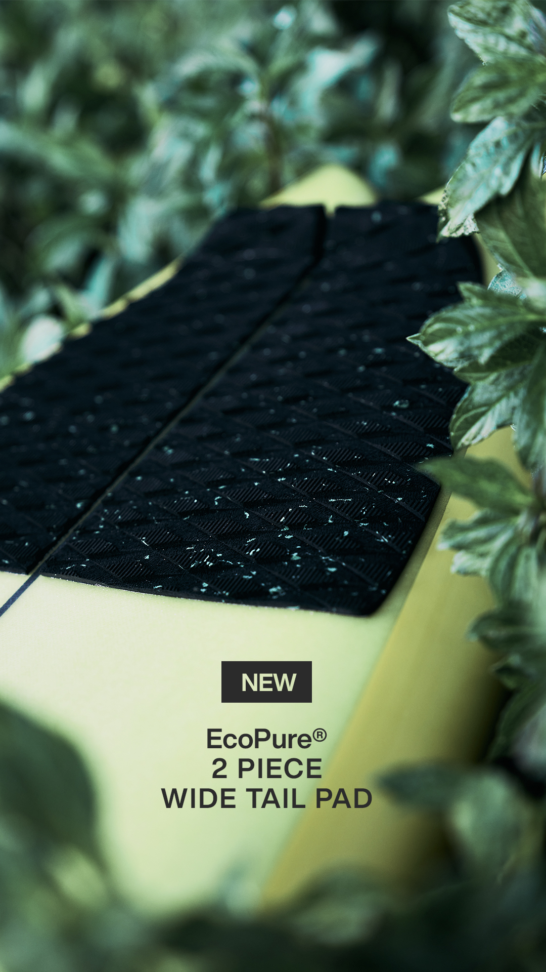
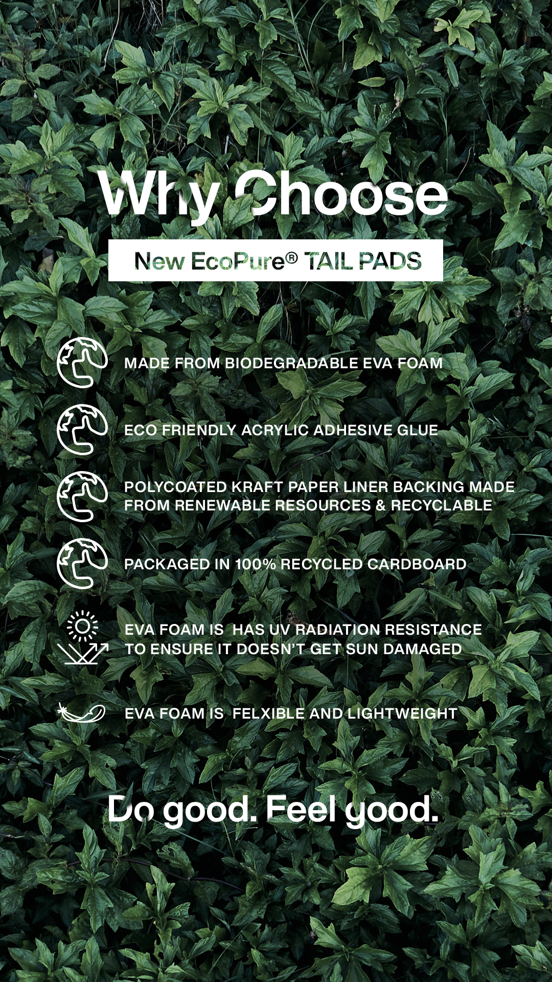
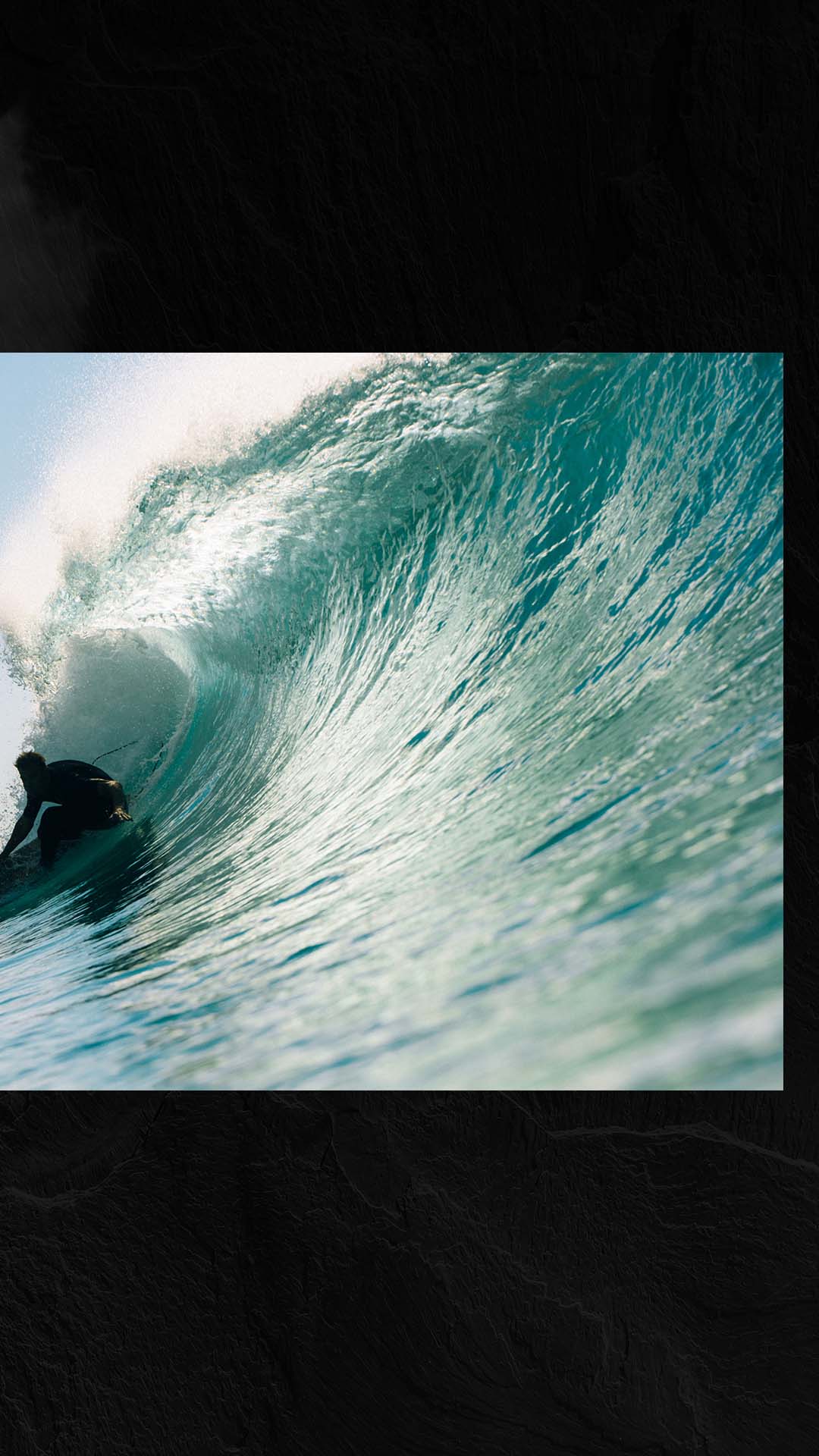
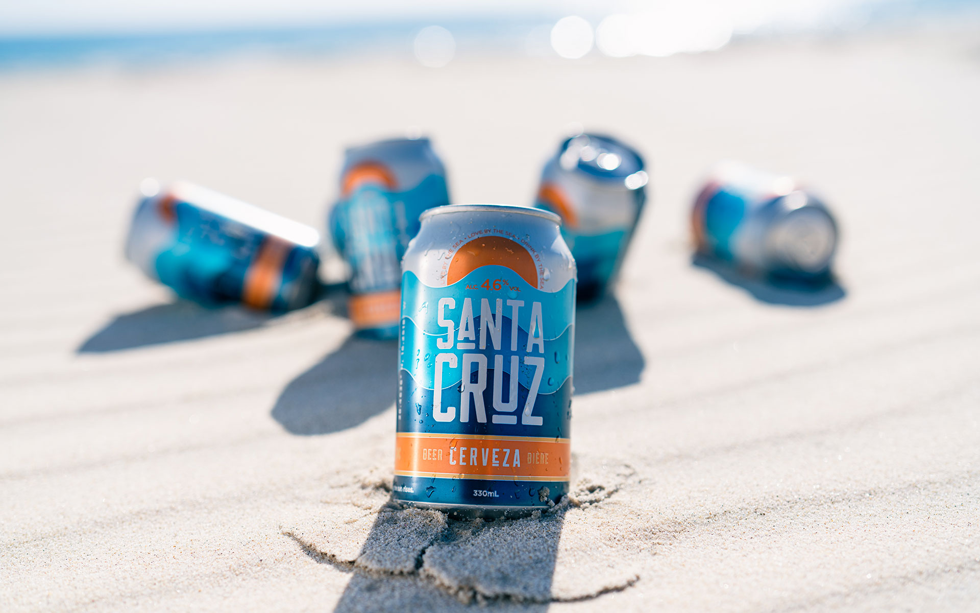
Campaign
Imagery.
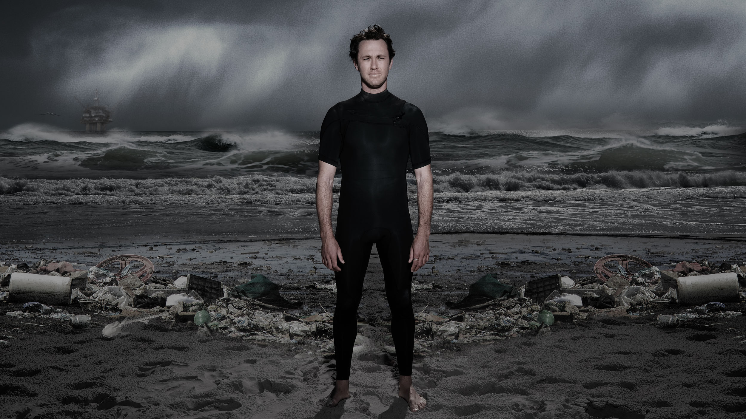
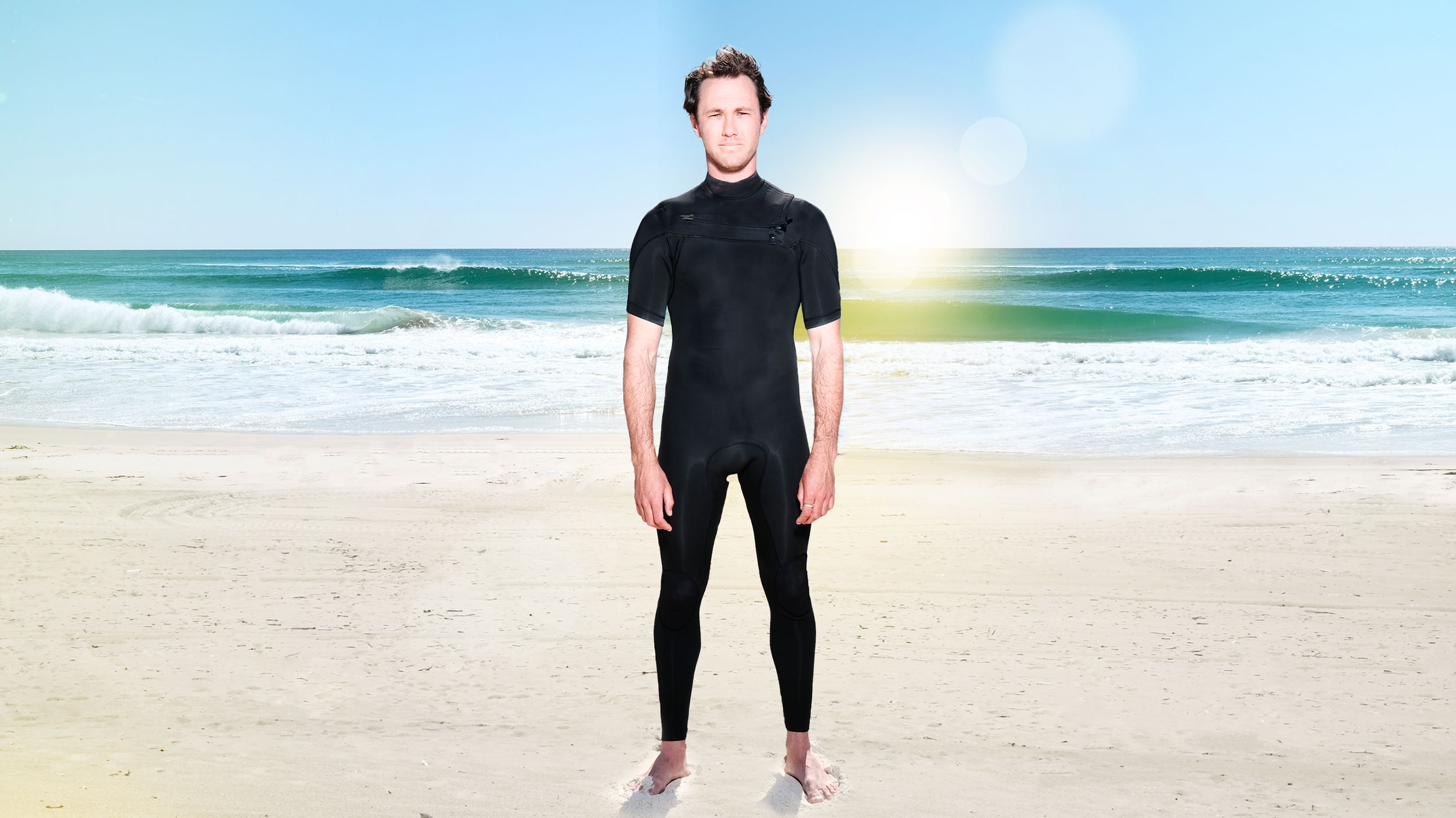
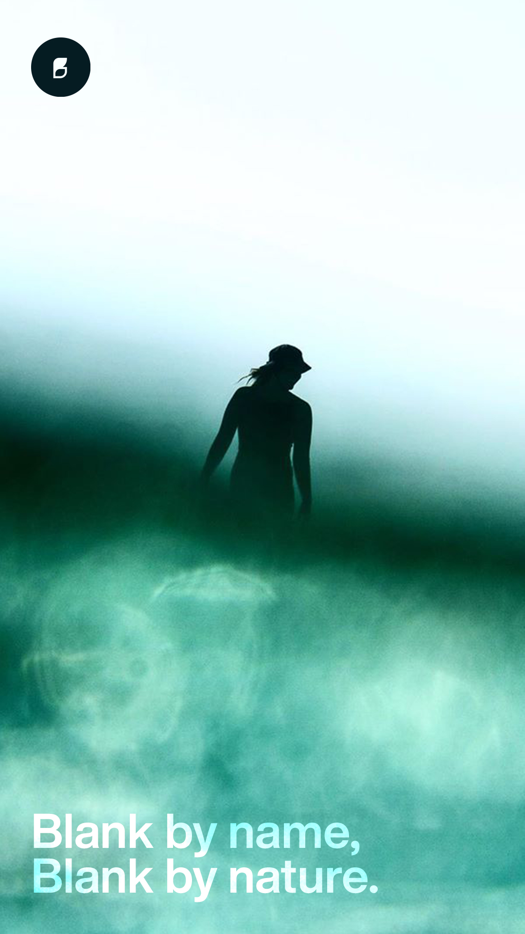
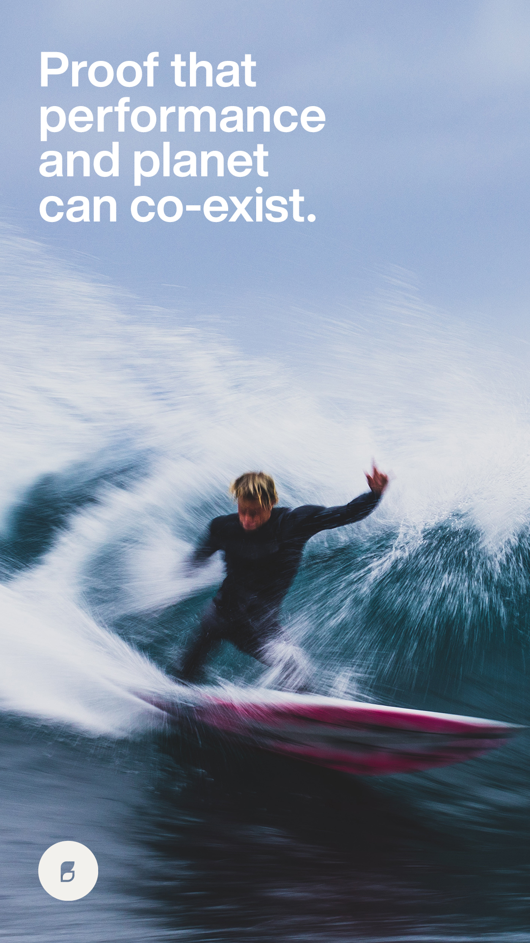
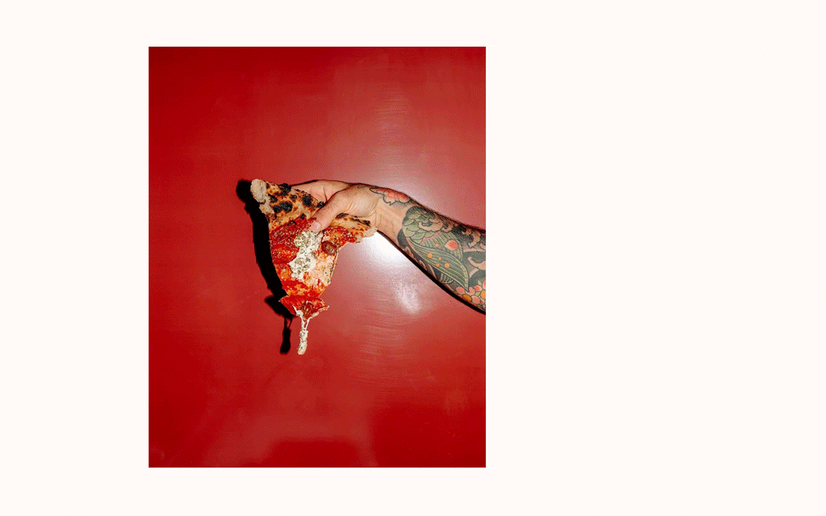
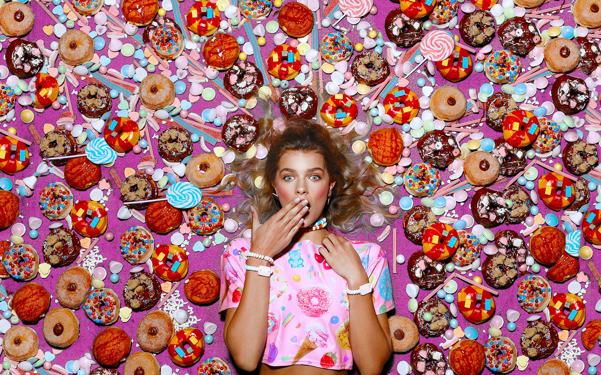
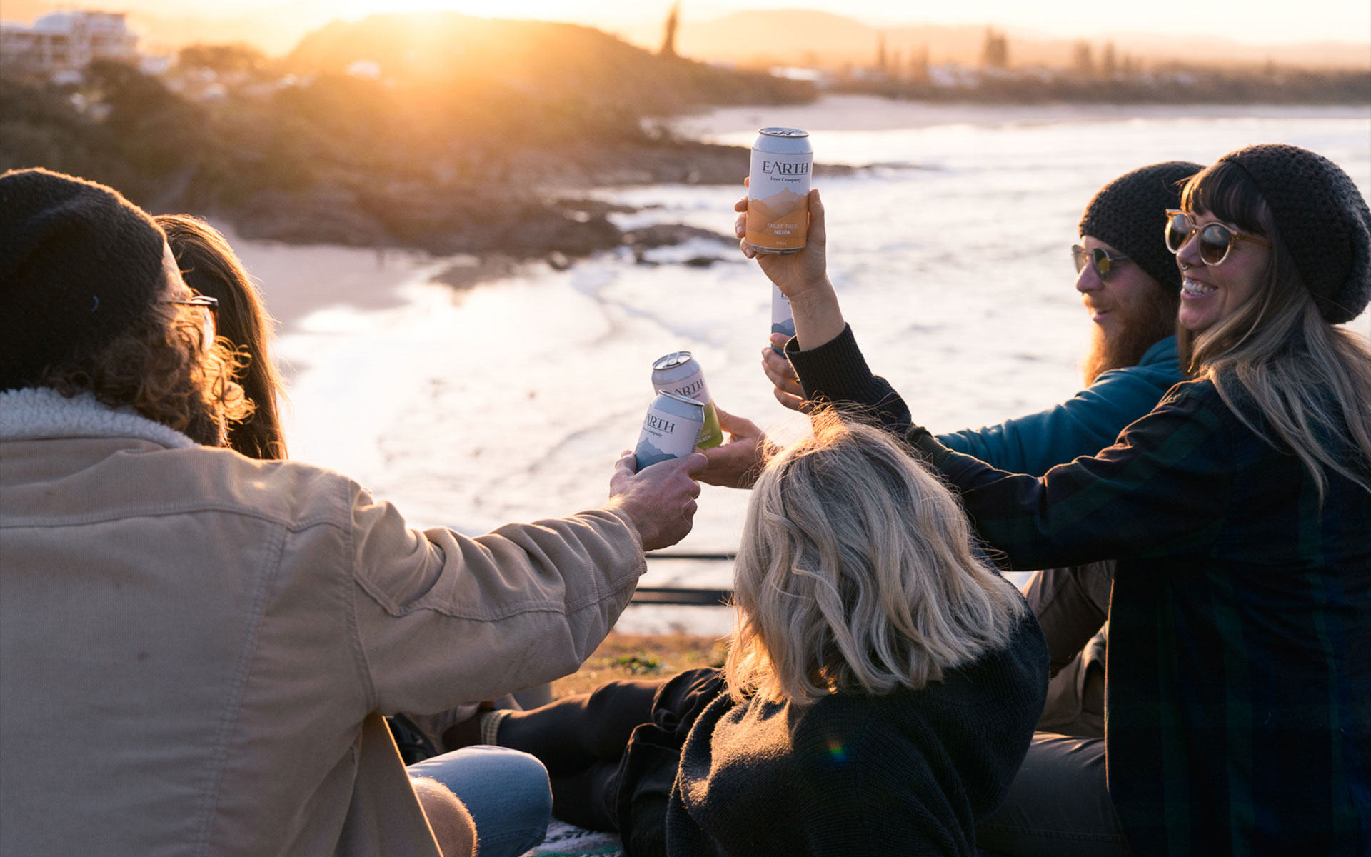
With product that was relatively flat in nature, with no branding, no design elements, just straight up functional product, we needed compelling imagery that backed up the brand ethos of "do good, feel good, go blank".
As a surf brand, it would be easy to focus solely on surfing, however, we always tried to ensure that we shot on locations that had greenery in the frame and or used green tinted boards to consistently reinforce that the product was green/eco based.
We also created multiple stop motion images to show the eco and biodegradable nature of some of their products and packaging.


GOING
CIRCULAR.
We are a fiercely independent creative design studio that believes business can be a force for good.
We want to work with clients with common interests and values. We are ambitious, we are relentless, we’re no stranger to taking risks in pursuit of creating something special.
We believe in taking a stand and making an impact. Most companies are scared to take a stand for the things they believe in - not us. We are passionate advocates for doing things the right way, for the right reasons with the right people.
We are alchemists of the imagination who believe that things of quality have no fear of time.

EMAIL DESIGN
COMPARISON.
When we started working with Project Blank, their email marketing was heavily templatised and stale with the same content often repeated heavily week after week.
We reimagined what this should look like and included more imagery and more of a brand story. that would captivate their customers. The result was a 23% uplift in open rate and click-through-rate.


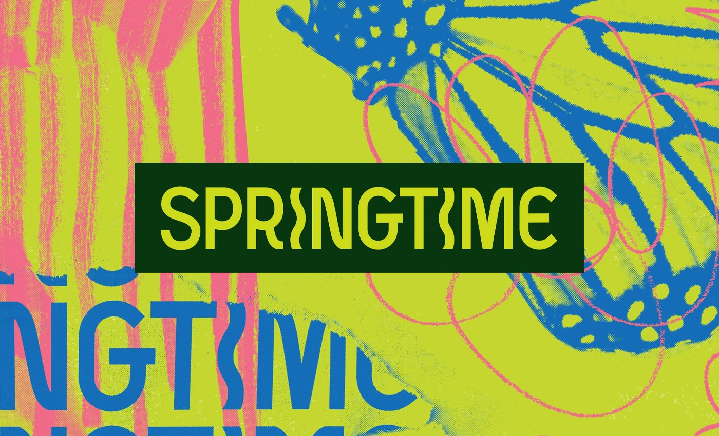
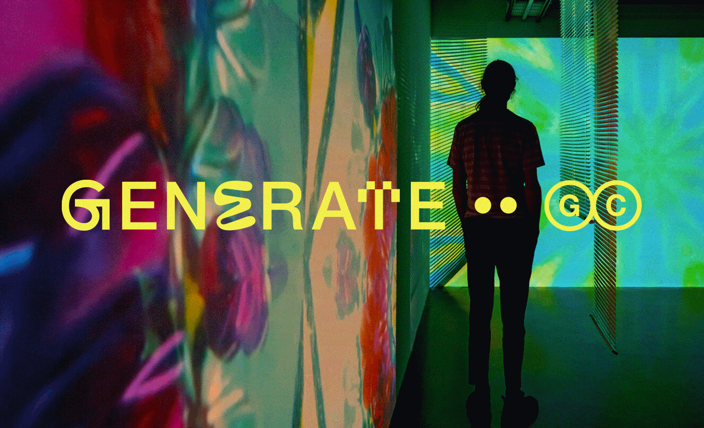
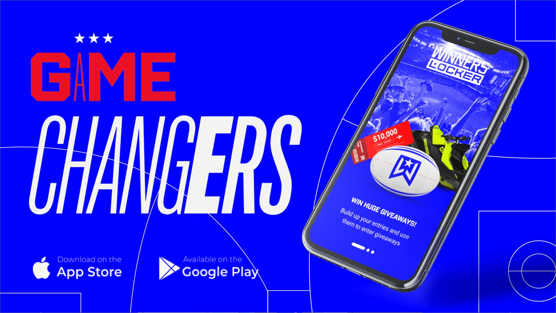
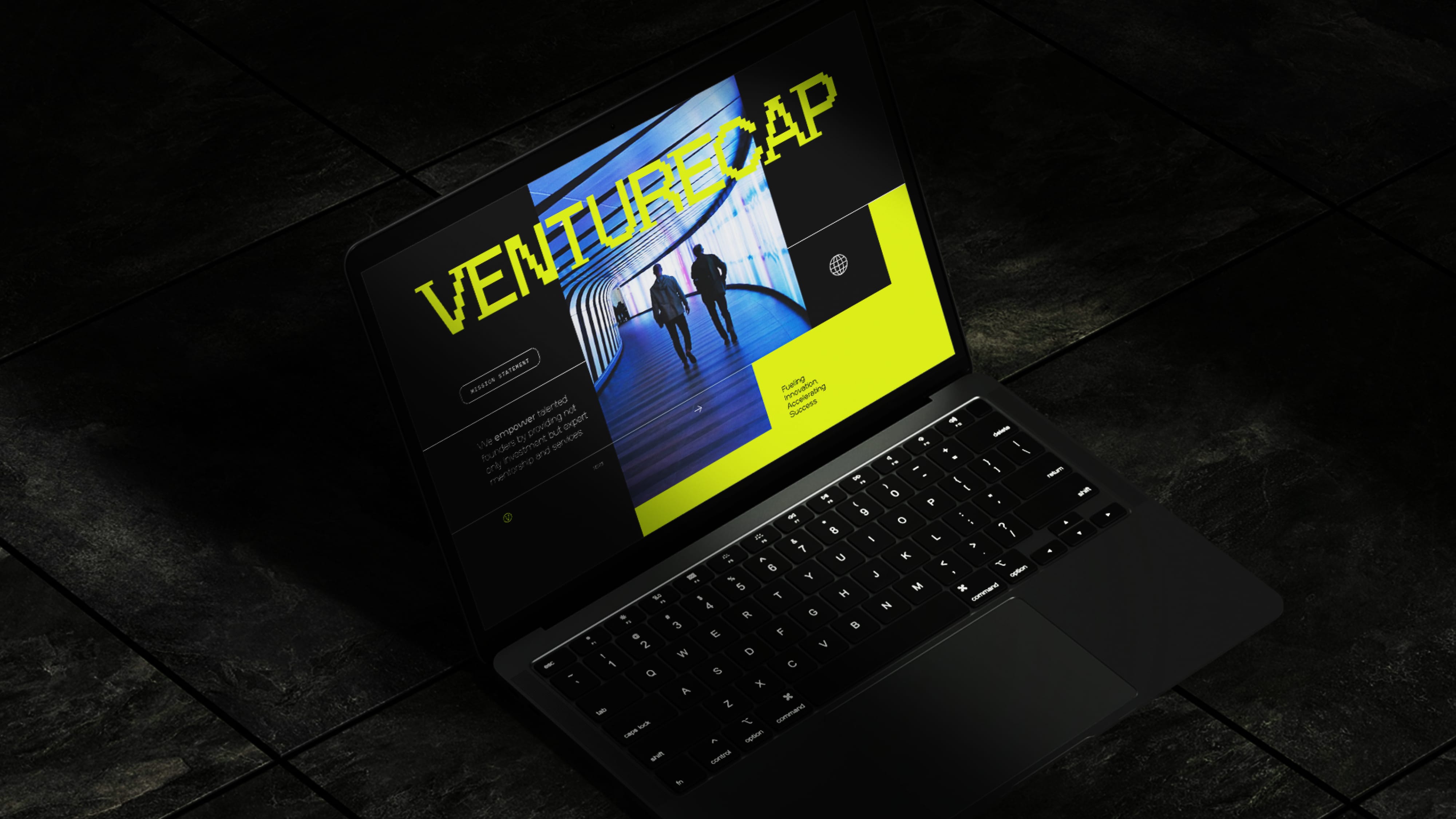
Case Studies


CONTACT /
20b Fifth Avenue,
Palm Beach, QLD 4221
(07) 5534 7761
hello@pennybridge.com.au
INFO /
FOLLOW /
Terms of Use Privacy Policy Code of Conduct